
In the previous post, I talk about the aesthetic approaches that have developed in this version, and the ways I have intentionally tried to create a new cohesive vision of how to design Mutant Standard emoji.
In this post, I’m going to go through the new emoji designs like I normally do with these posts!
Content Warning: I’m gonna be going over some alcohol and food emoji designs.
MutStd sketch 2017.09.?? – Unfinished ameneties sketches
As you can tell from the filename, this one was hanging around for a long while. I decided to finally make an okay-enough version.
MutStd sketch 2017.10.15 – Continued Office/Stationery/Symbol sketches 1
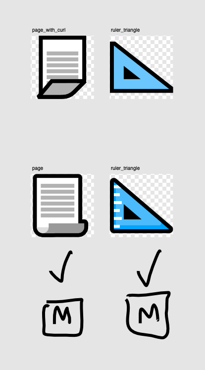
Another one that has been lingering for a long while. Not that keen on the curling page, I can come back to it. The triangle ruler’s colour and shape came from a replacement icon set I made for Clip Studio Paint a couple of years ago, the aesthetic of which was a significant starting point for Mutant Standard itself.

MutStd sketch 2018.01.31 food and drink continued

The last very long left over emoji. At some point I realised:
- How bananas actually look and should be shaped.
- As I mention in my piece about aesthetic, I stopped trying to strictly use only certain vector tools and geometries.
Once those were past me, I could actually make a good banana! All of the bright yellow ones were old iterations, the one on the right was the one I just made on the spot.
I really like the subtle shading going on here, and the way the banana feels like it’s both balancing and not still because of how it’s tilted up slightly on the right. (this was also just because it meant I could make the banana bigger and take up more space in the square frame)
MutStd sketch 2018.08.06 More weapons
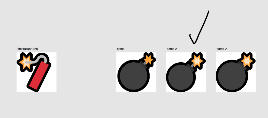
Continuing on the success of the Firecracker emoji from 0.3.0 in the form of the bomb, which has very similar visual cues going on. Not shown here is the shading I added to the masters file at the last minute.
MutStd sketch 2018.09.15 religious buildings 1
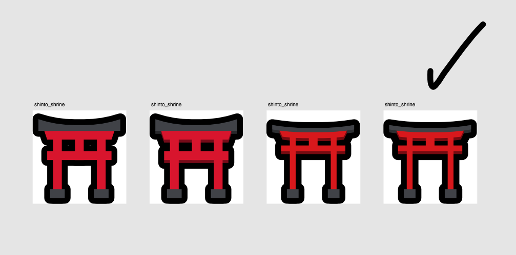
I tried other buildings in this production cycle, none of them were successful. What was reasonably successful was this design for a shinto shrine torii. I was originally pretty content with the first version but later realised it looks too chunky and it could do with some depth, so I gave it some.
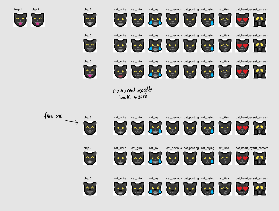
MutStd sketch 2018.10.09 blep
Doing a blep emoji made me realise that I had made the subconscious decision to give the black cat a gray mouth the entire time, which may or may not have been the best idea. So I experimented with different mouth colour palettes (the top block of emoji tests) to make the blep look consistent with the other cat smilies.
Even if it is a bit abstract and strange, I found the gray mouth to be the best-looking option. While I was here, I also made the nose on the cats a little darker (bottom block of tests) than the mouth line colour, to make the cat look less flat.
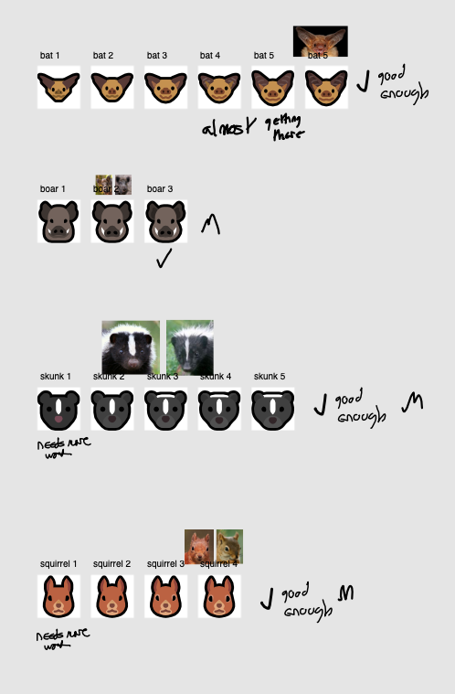
MutStd sketch 2018.10.14 new animals
MutStd sketch 2018.12.03 exclamation question marks
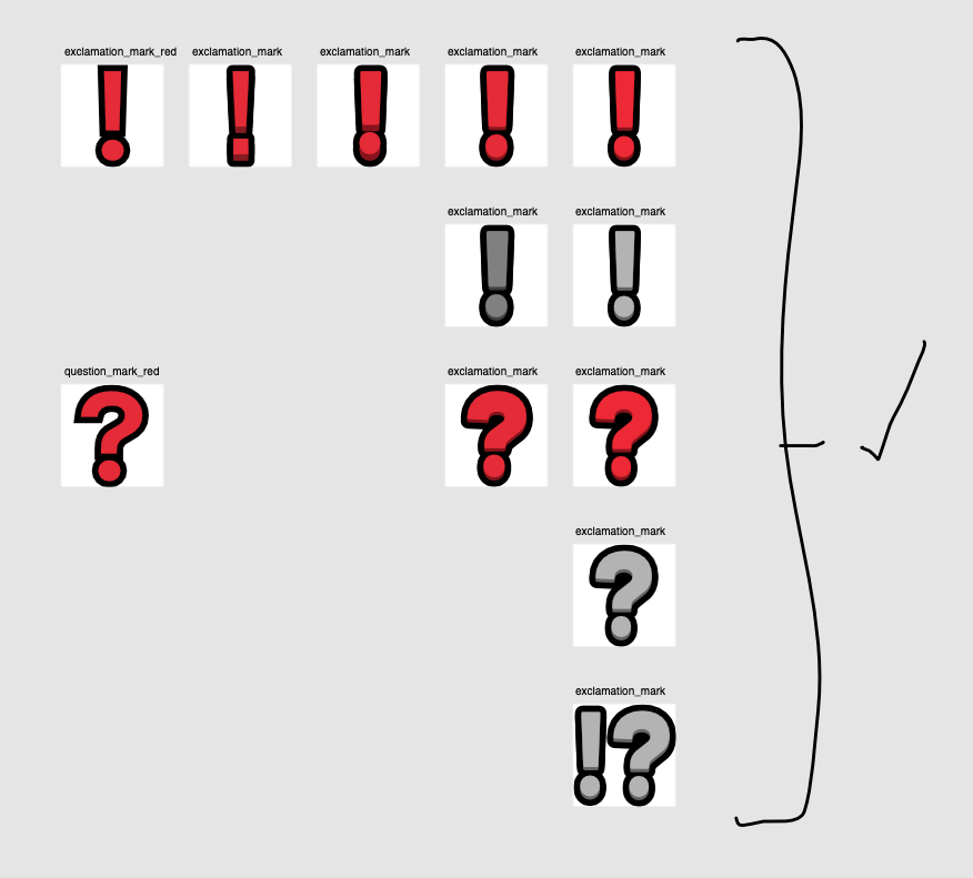
Following 0.3.0’s 3D arrows, I wanted many other symbols to have a little bit of depth in them. I also didn’t like the font I was using in these specific emoji, which was a really old font that was used in the early days of the project, but I stuck with it for just these because they had round dots for exclamation and question marks.
I changed them to Mutant Standard’s new branding font, Barlow. It’s sort of a shame Mutant Standard’s text symbols aren’t 100% consistent, but I’m okay enough with the current state of things for now, and because both of Mutant Standard’s text symbol fonts now have similar characteristics (they are both derived or inspired from DIN fonts), most people probably won’t notice.
MutStd sketch 2018.12.03 text symbols
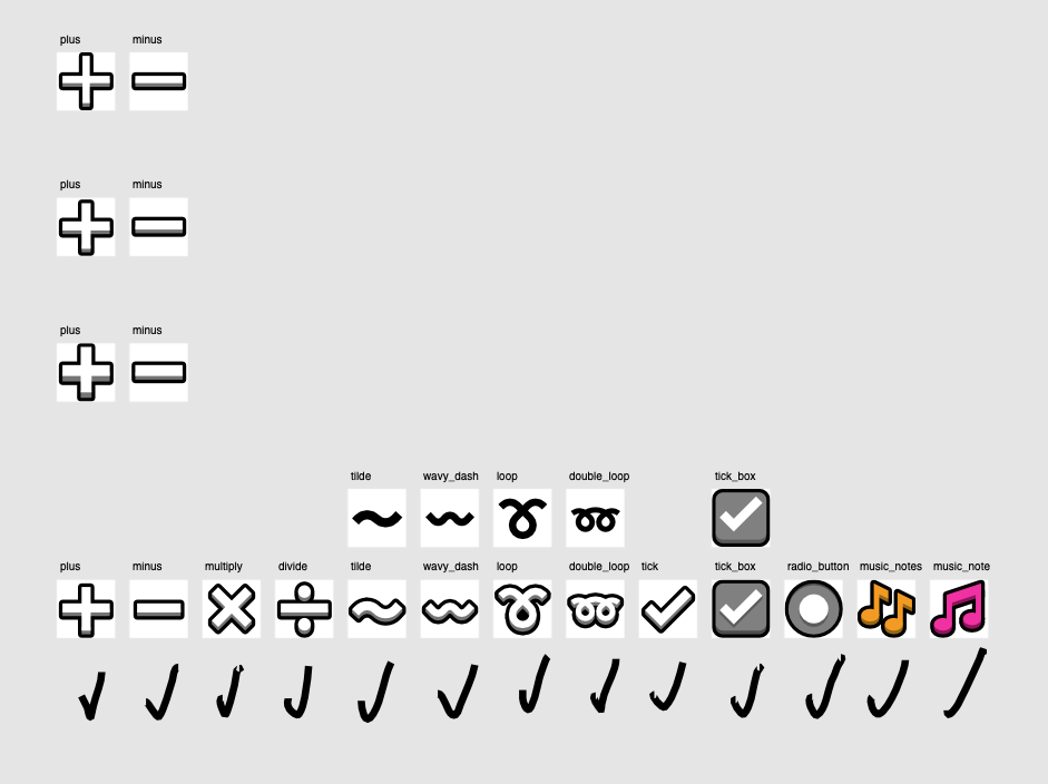
More 3D symbols!
Tilde isn’t a Unicode Standard emoji, but I thought it would be fun to have given how much use it gets in certain spaces on the internet~~~ It could also be a fun counterpart to the wavy dash, which is a Unicode Standard emoji.
Because Unicode can be weird and redundant with the way it does certain things, I was originally going to get rid of the green tick and just replace it with the simple bare tick here to simplify the amount of ticks in the set. I decided to go back on that at the last minute, for now.
MutStd sketch 2018.12.14 speech and sound
The speech bubble emoji here are so simple but they feel so goooood.
MutStd sketch 2019.01.11 notdef
I originally wanted to have a ‘notdef’ character (not defined) because at the time I thought that font making conventions dictated there needed to be one. It became less clear the more research I did so it’s not currently in the fonts because it’s unclear whether that is necessary or not, but I think having a notdef emoji is kinda fun anyway, so it stays.
The new approach to the drink icons was inspired by various works of Susan Kare.
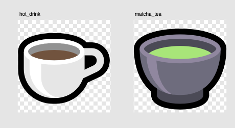
I like how much simpler the coffee emoji is. It has a much stronger silhouette and the visible rim makes it look much more like a solid object rather than the papery kind of look the original had.
I added a shine at the last minute and I’m really glad I did because it looks awesome. This exact same approach was also quickly applied to the matcha tea emoji.
MutStd sketch 2019.01.13 updated food
Still not 100% keen on these but they do look better thanks to the brighter, more contrasting colours and the 3D rims on their bowls, just like the new coffee cup.
MutStd sketch 2019.01.15 tumbler glass
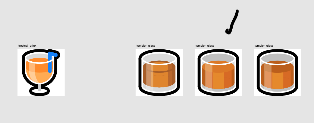
This one was tricky because i had to make the lighting effects look like it’s actually whiskey without undermining the simplistic shading of Mutant Standard. I think I did a pretty good job balancing it.
MutStd sketch 2019.01.16 beer
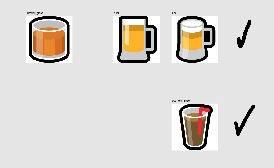
MutStd sketch 2019.01.25 doing the rose IM A REAL SOCIALIST
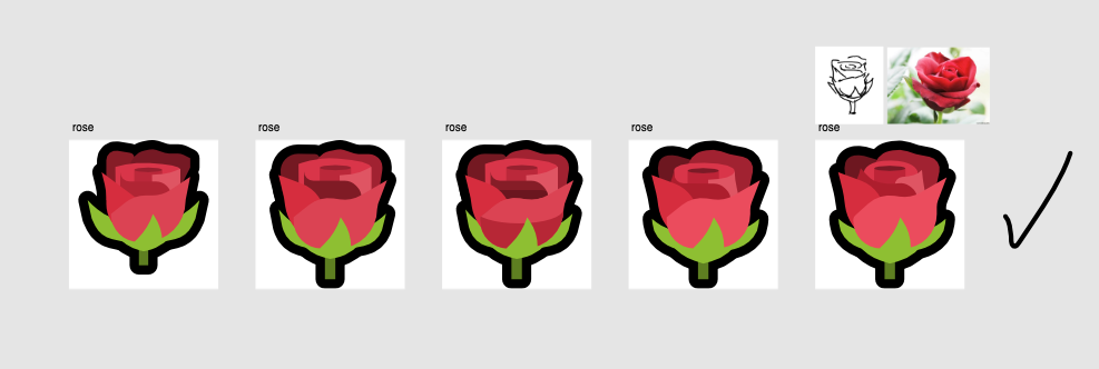
I am a real socialist (technically a communist, which is a type of socialist sooo whatever).
I felt it was about time I did a rose emoji, and I am really really happy with it. It very much embodies the lack of rigidity the new aesthetic is leaning towards – there’s a lot of bézier curves in here and deviations from the standard grid, but it still looks great at smaller sizes.
MutStd sketch 2019.01.26 rainbow
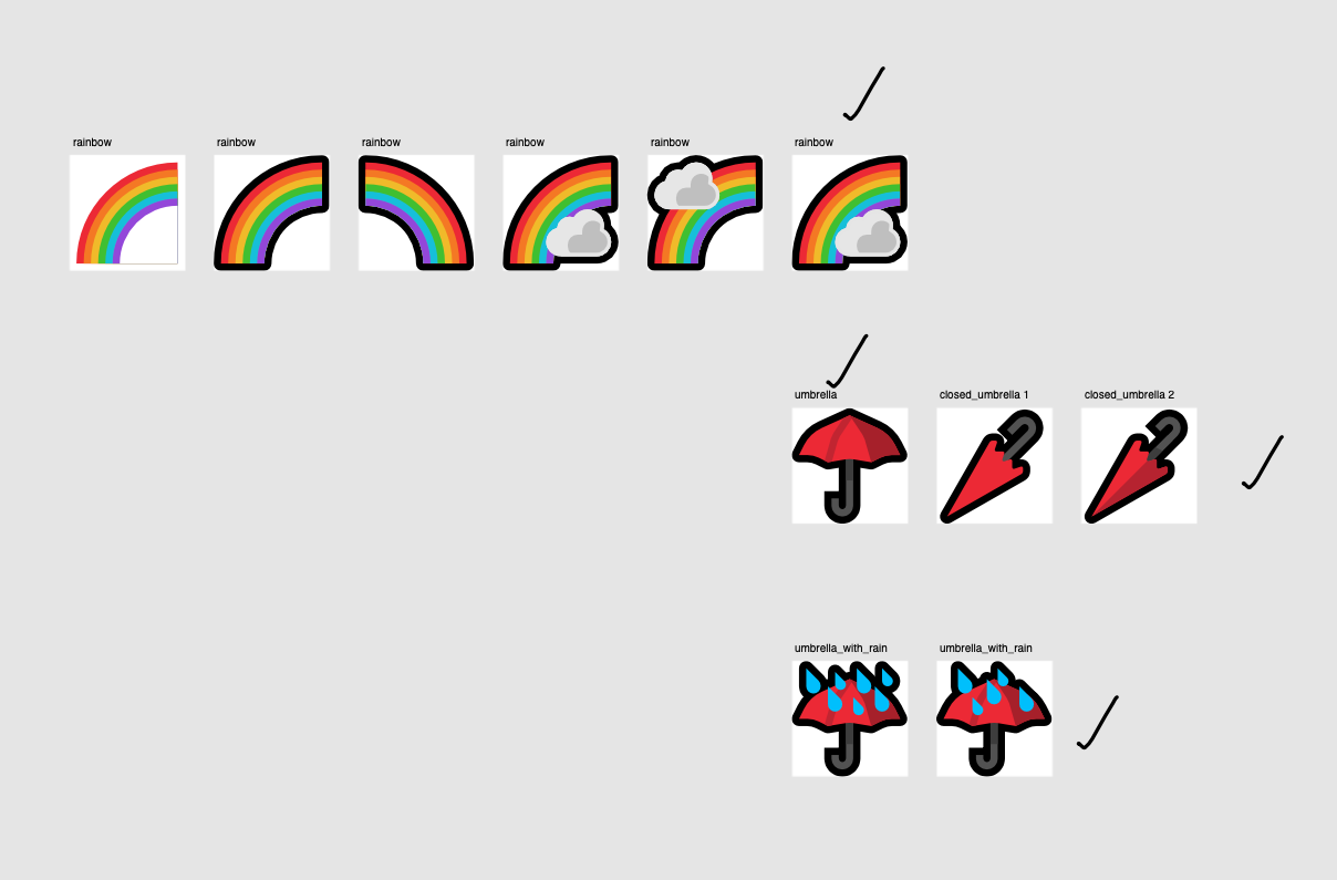
I think in hindsight, turning red_umbrella into just umbrella was a mistake. The original reason for doing it was that there needs to be an umbrella emoji, and I might as well use the one I have, which I still wanted to be red. But in doing that, it takes away the specificity and the explicit ties to sex worker activism the original had.
I’ve also been struggling to deal with emoji that are encoded vs those that aren’t encoded and how to think of them structurally in the project, so when I figure that out, I might go have both a red_umbrella and umbrella in the future, even if they are the same emoji picture.
MutStd sketch 2019.02.07 maple leaf
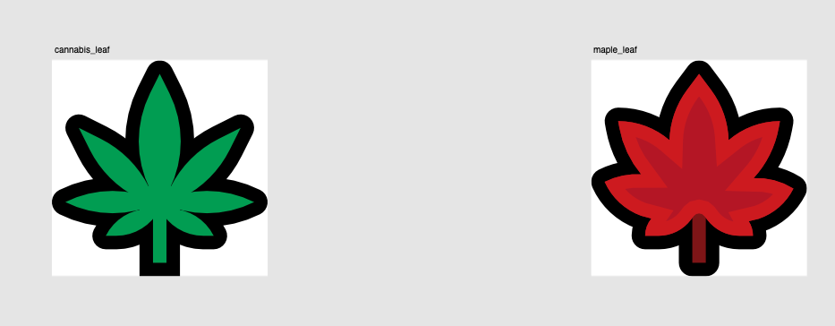
Many Japanese emoji sets depict the maple leaf as a Japanese maple leaf, many American emoji sets depict the maple leaf as a Canada-flag style maple leaf. I decided to try to create a fictional compromise between the two.
The design was derived from the cannabis leaf.
MutStd sketch 2019.02.07 sports balls
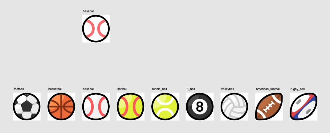
These are pretty alright, nothing much to say here. I think I need to work on my shading technique more for many of them. The rugby ball is my favourite design out of all the ones here.
MutStd sketch 2019.02.09 train improvements
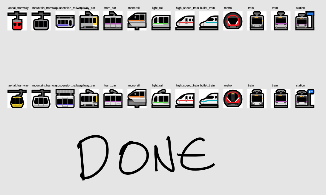
I did these during my very first Twitch stream in February. I’m really really happy with these improvements (bottom row).
I probably should change the metro train from something that isn’t so obviously London Underground because you only really see those types of trains on the London Underground, but I also really really like the way it looks and I don’t personally like square underground trains nearly as much. >:|
(There is also the added benefit that the train is more visible because it’s circular, therefore it can take up more of the hole’s space)
I’ll have to square up with my attachment to it sometime in the future.
MutStd sketch 2019.02.11 buses
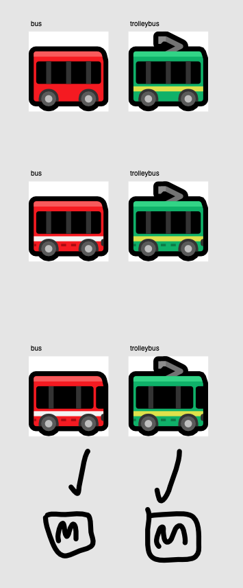
Continuing the design patterns in the updated trains into my first road vehicle emoji.
MutStd sketch 2019.02.13 airplane
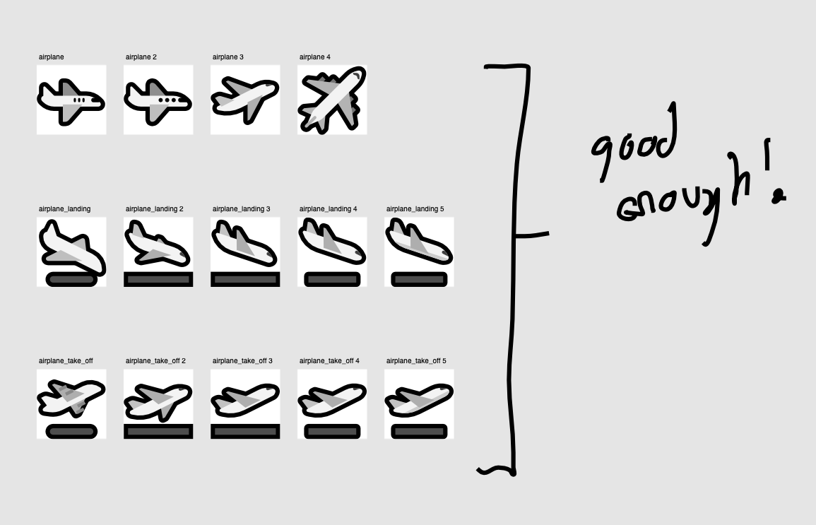
This is the start of me making emoji I needed to make a working, full emoji set for fonts.
Many emoji are ‘ligatures’ – combinations of multiple characters put in sequence, and to make a valid font, you have to make sure that for every ligature you have, all the parts of it are represented somewhere in your font.
eg. pilot (which I have had for a long time) is formed from a ZWJ of adult + airplane.
I just made the departure and arrival ones while I was at it with the airplane.
MutStd sketch 2019.03.08 – ligature symbols 1
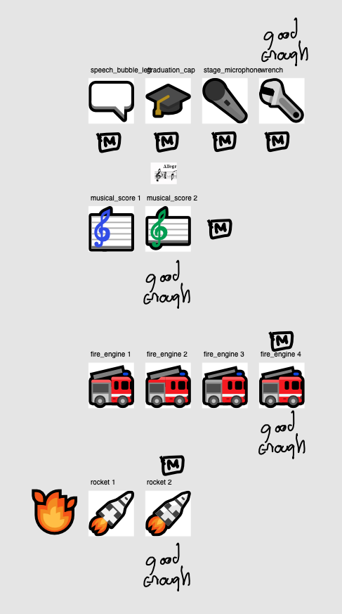
speech_bubble_left– required for eye speech bubblegraduation_cap– required for studentstage_microphone– required for singerwrench– required for mechanicmusical_score– not actually required for anything but I decided to make it herefire_engine– required for firefighterrocket– required for astronaut
I really like the way wrench and fire engine look. I also think rocket is pretty good (which significantly breaks from emoji convention by opting for a rocket design inspired by real rockets.)
MutStd sketch 2019.03.19 – ligature symbols 2
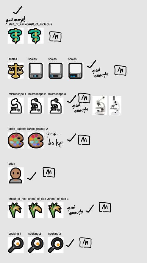
staff_of_asclepius– required for doctorscales– required for judge (get it? hahahaha)microscope– required for scientistartist_palette– required for artistadult– required for all role/profession emojisheaf_of_rice– required for farmercooking– required for chef
Opting for digital scales was part laziness, part continuing the logic elsewhere in the set that tech items should be contemporary in the way they look.
It’s kinda funny that Mutant Standard’s judge is a literal mix of an adult and a digital kitchen scale.
MutStd sketch 2019.03.10 ligatures 3
It’s the last two!

factory– required for factory workerschool– required for teacher
I’m not that keen on the school in hindsight, but I had to make something just to get the font working. I really wanted to make a school design that was much more internationally generic than the typical form that other vendors use.
One of the ways I wanted to do that was to try to rely on certain architectural cues, like the fact that a school must have classrooms. But it doesn’t come off quite right, so I’ll probably go back to it sometime in the future.
MutStd sketch 2019.03.25 Smiley expreiments + MutStd sketch 2019.03.28 Smiley improvements 2
At the last minute, I felt like improving the smiley designs, and I’m glad I did.
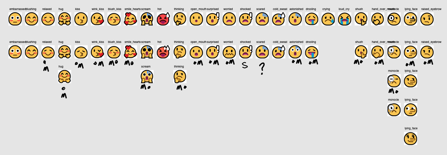

In general:
- I’ve added some more squish to give them a greater sense of body movement (like in
relaxed,kiss,expressionlessanddisappointed). - I made overlapping hands a darker ‘inside outline’ instead of a black one (in emoji like
thinking,hand_over_mouth, andshush) because the black looks a little unpleasant, flat and doesn’t scale as well. - Inspired by a recent commission and some new inspiration, surprised eyes are no longer black, and they look a lot better and more lively for it.
- 45˚ angles no longer used for closed eye lines (like in
drooling) because they looked a little wrong and don’t emote as well. - Shading was added on various overlapping elements that didn’t have shading before, like halos, tears and confetti.
- Various emotes were differentiated more from each other.
Despite improvements I have made before, i was still particularly not happy with the open-mouth smiling emoji. I feel a lot better about them now, especially big_smile.

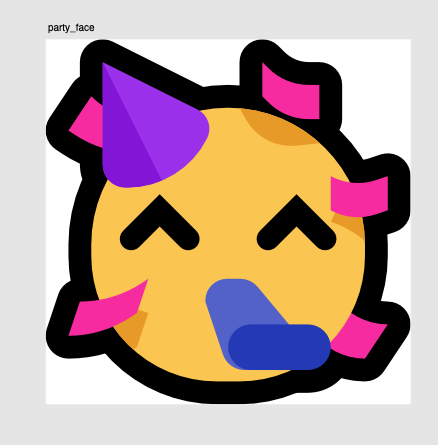
The shading on party_face is really good too.
MutStd sketch 2019.04.02 Mountain design improvements

Quickly giving the scene emoji some improvements. Mainly rounded borders, but also a few little tweaks here and there.
mountain‘s colours were adjusted after my colourblind enbyfriend told me that for their colourblindness, the mountain blended in with the sky, so I made it stand out much more.
While I was here, I also made volcano look better. The original design was kinda basic and weird and cartoony, which isn’t quite my style here. It now looks way better.