In this post, I’m going to go over the variety of realisations I’ve made in my design process that have led to the various significant improvements that were made in 0.4.0.
0.3.0 gave birth to some new ideas of how to progress the aesthetic and design approaches of Mutant Standard, but they were incomplete ideas and I was left lingering with possibilities of (in my mind) greatly improving and developing how Mutant Standard emoji are designed, but in order to put most of my efforts in making new emoji, I sidelined this.
This led to Mutant Standard 0.3.1 – which wasn’t a bad release by any means, but to me just wasn’t that great because previous emoji conventions were really constraining what I felt could be done.
So in 0.4.0, I decided that if I were to continue in any meaningful way, I had to spend time and deal with this aesthetic technical debt.
I don’t think this process is done, but it has gone a long way in getting there and I think it gives me much more free space to proceed with new emoji designs and I have a much more concrete and better idea of what it is that I feel makes Mutant Standard Mutant Standard.
My commission work and side projects have contributed a lot to this, in which I have experimented with new approaches and techniques to tackle those particular design challenges. I also found some good new design inspiration.
Some realisations from previous versions
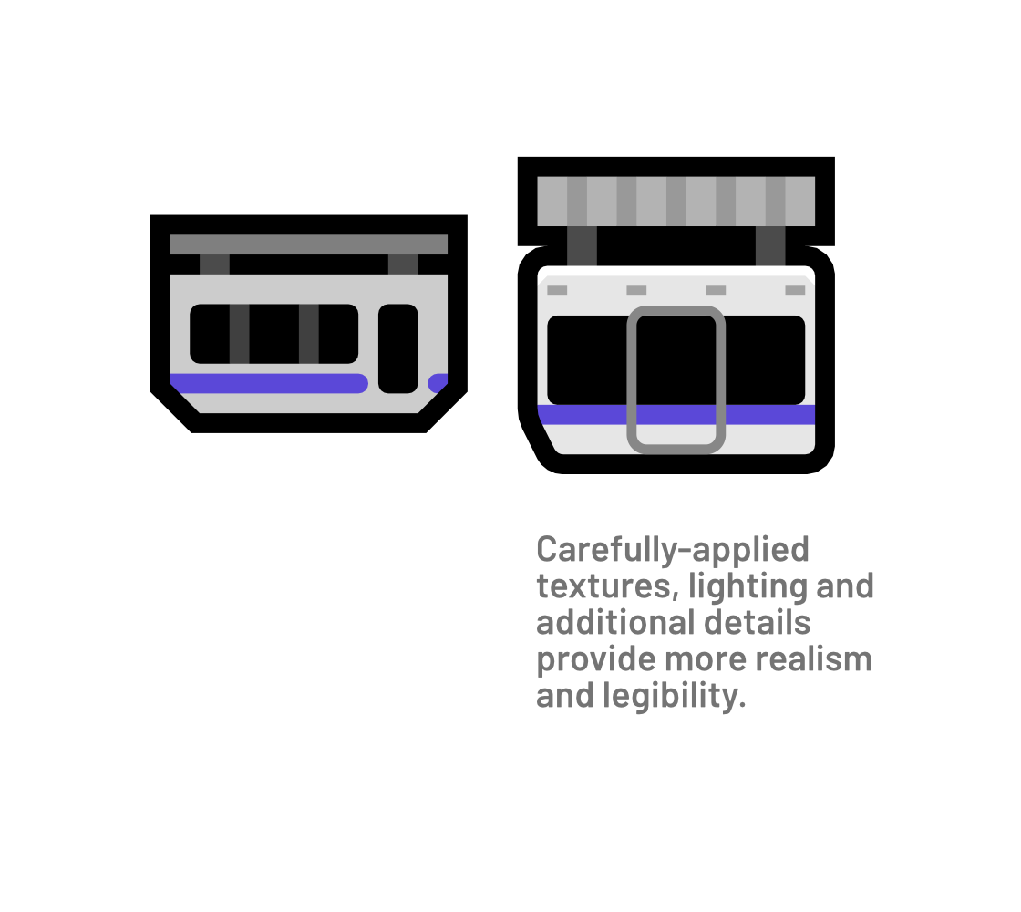
- Nuance and detail do not necessarily detract from clarity. Older versions of Mutant Standard had a very binaristic approach to detail, akin to wayfinding signage – it’s either negative or positive space, it’s either solid or shading. This doesn’t have to be true, and can lead to flat and stale-looking designs, especially with the direction I was going in.
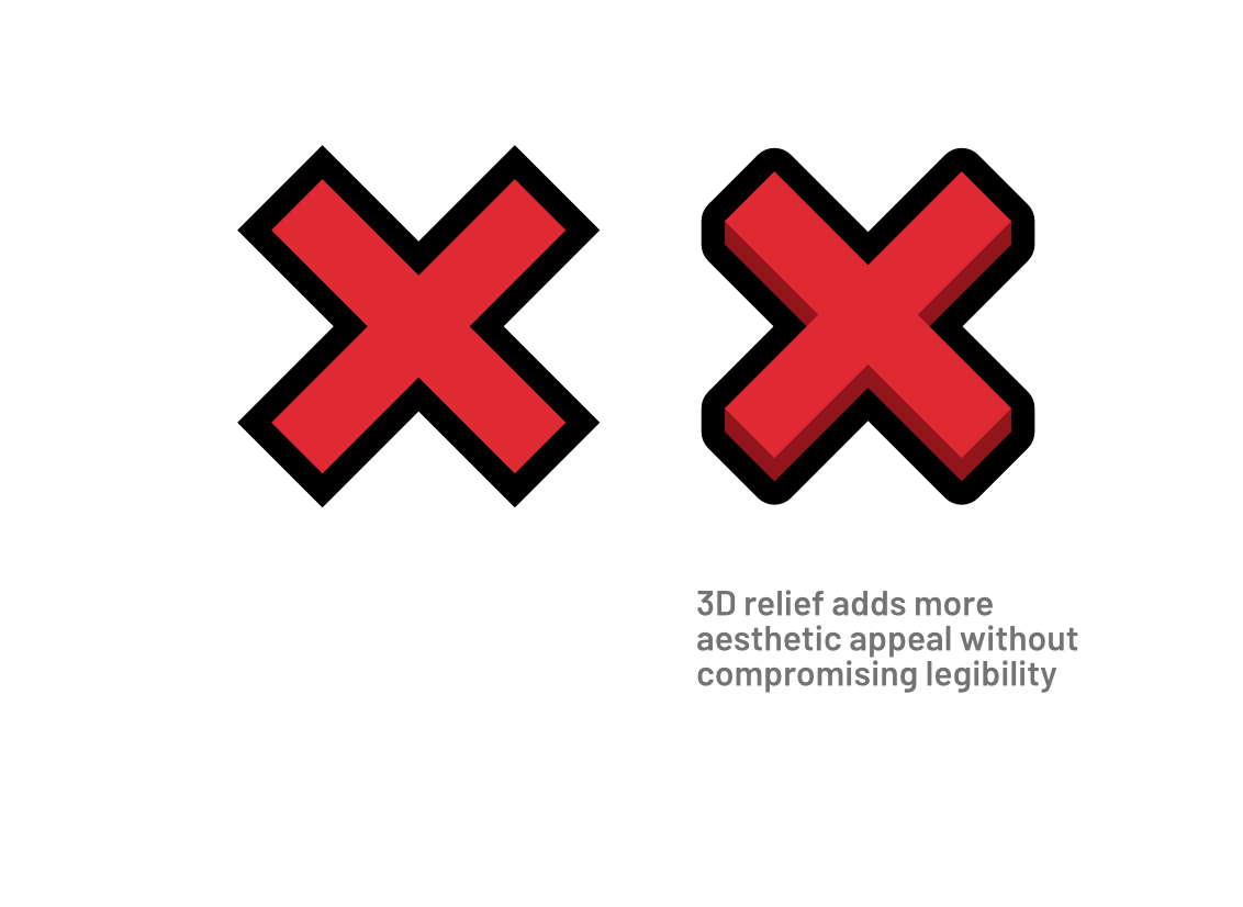
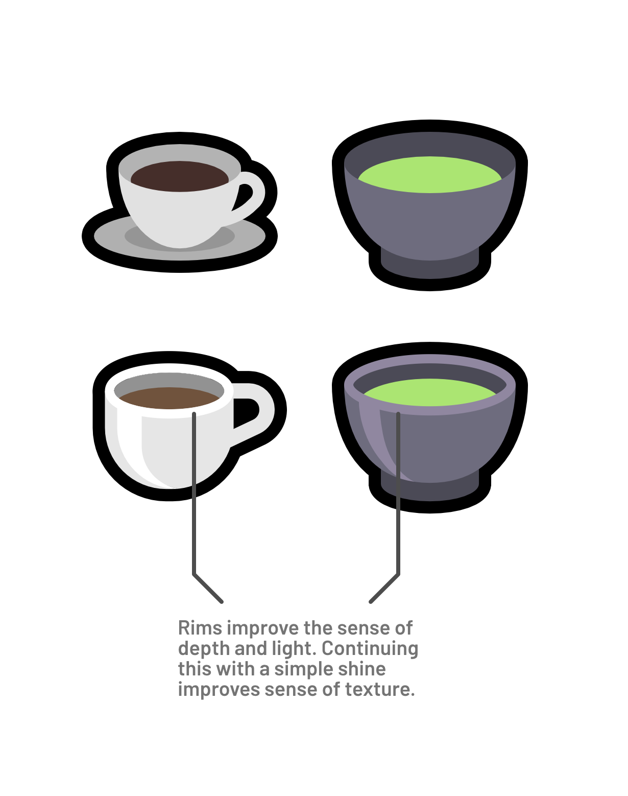
- Depth and details are important for creating visual interest and aesthetic appeal. Detail can just exist because it’s just nice to look at, and if it doesn’t take away from the legibility or the overall aesthetic vision, why not have it?
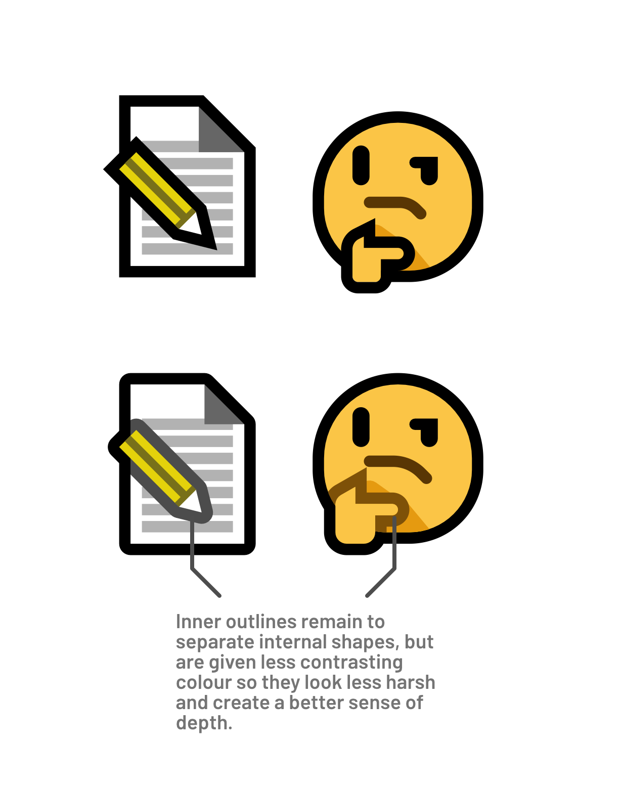
- Depth and lighting cues can improve readability. Humans react to depth and lighting cues, it can enhance the perceived contrast of an image, as well as making an object’s form easier to identify.
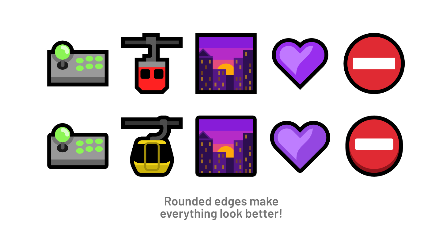
- More complex geometry is okay as long as it works the same in the end. A lot of Mutant Standard’s problems aesthetically for me have been caused by rigidly following a certain set of rules I have given myself. Doing commissions where I normally tackle more complicated subject matter, I have to use more complicated and less rigid methods. This has made me realise that having more detail can just make things look better while maintaining the same legibility.
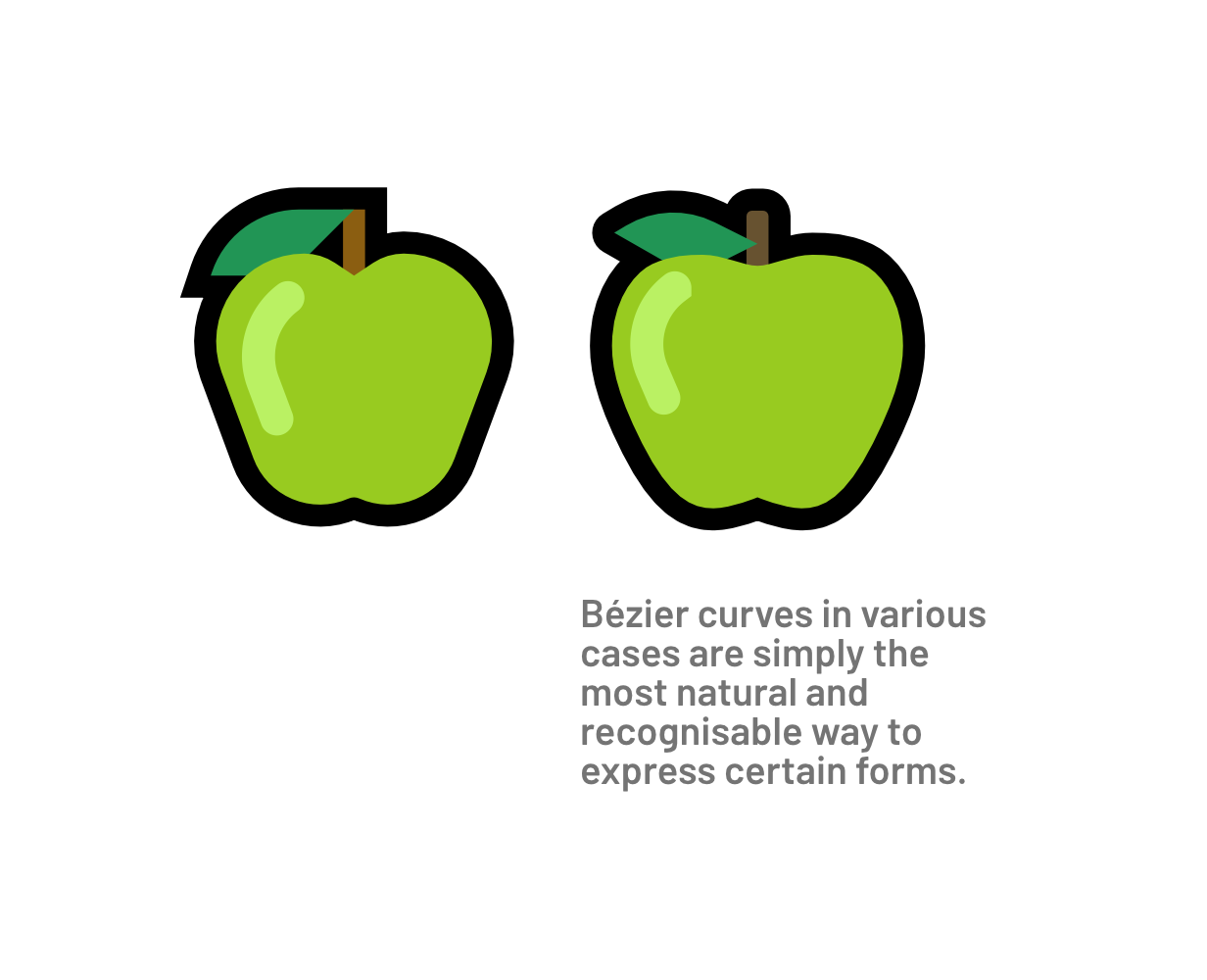
So in one way or another, I have tried to work on these realisations, creating emoji designs that have more detail, more shading, adopting Bézier curves where it makes sense to, etc.
I still want to be particularly restrained in various ways with these things because I don’t want to make the image feel muddy or over-embellished. For instance, gradients are still not a thing and like most designs, there is only ever one step of shading or lighting for any given surface.
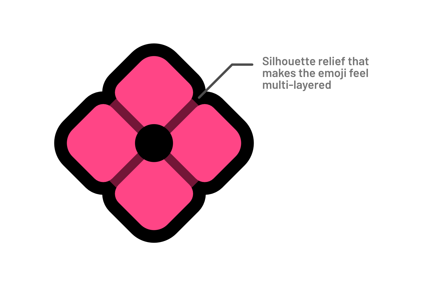
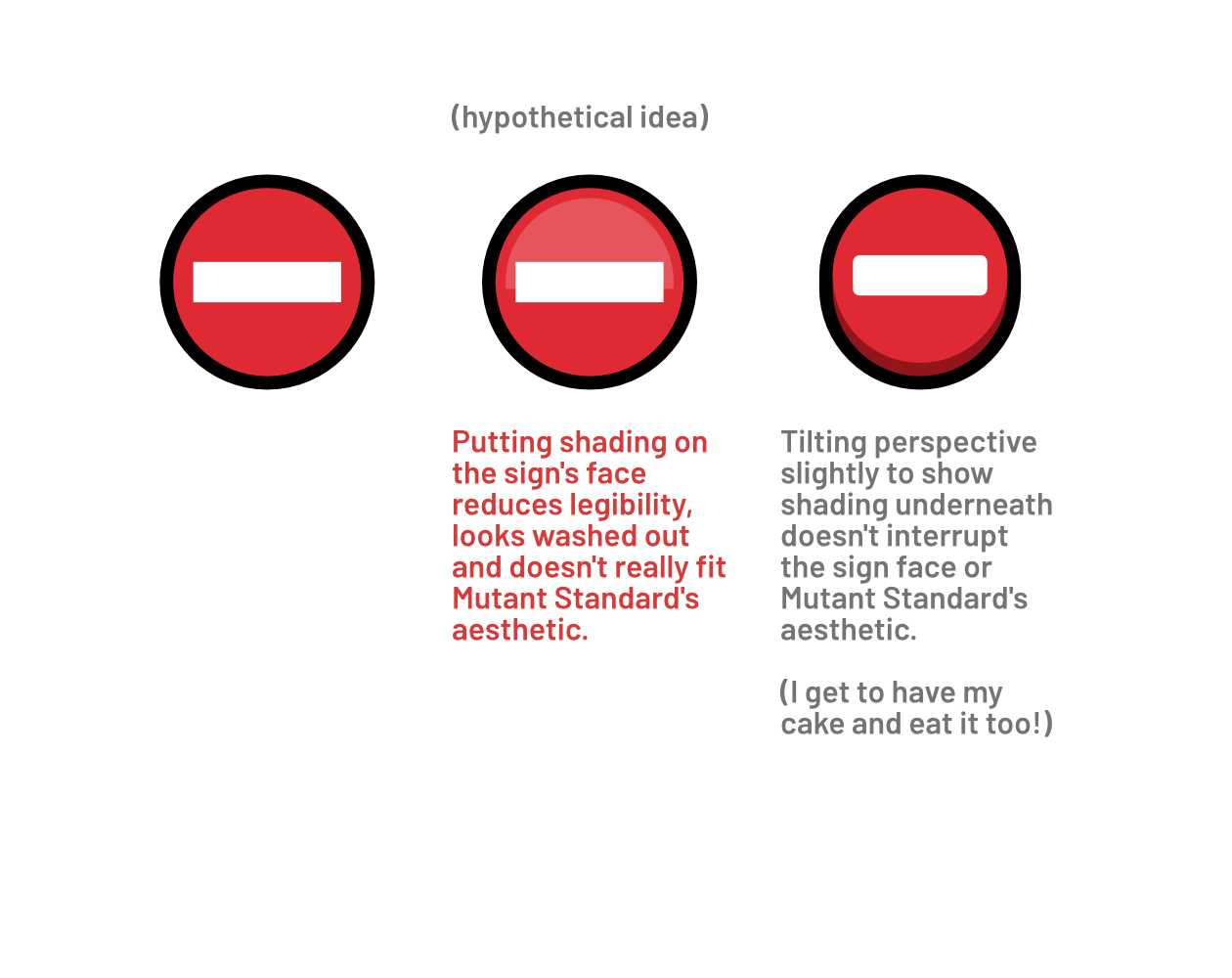
Another way I found I could improve depth while maintaining clarity was adding depth cues on the bottom of signs and icons, where they wouldn’t impact the contrast between the foreground and background of a symbol. This way, it also maintains the snappiness and sharpness of the set’s aesthetic that I very much want to keep.
A bunch of quick examples of improvements in 0.4.0
