Endless, endless testing.
0.3.0 was partly a new emoji update, but also just trying to tie up more loose ends for the future. I wanted to be super-satisfied with various core elements of the aesthetic and design philosophy so I could move on with bigger changes and more new emoji without feeling like I have things left behind or unresolved design issues.
It also means that updating Telegram sticker sets and merch would be easier because existing designs won’t keep continually changing from version to version.
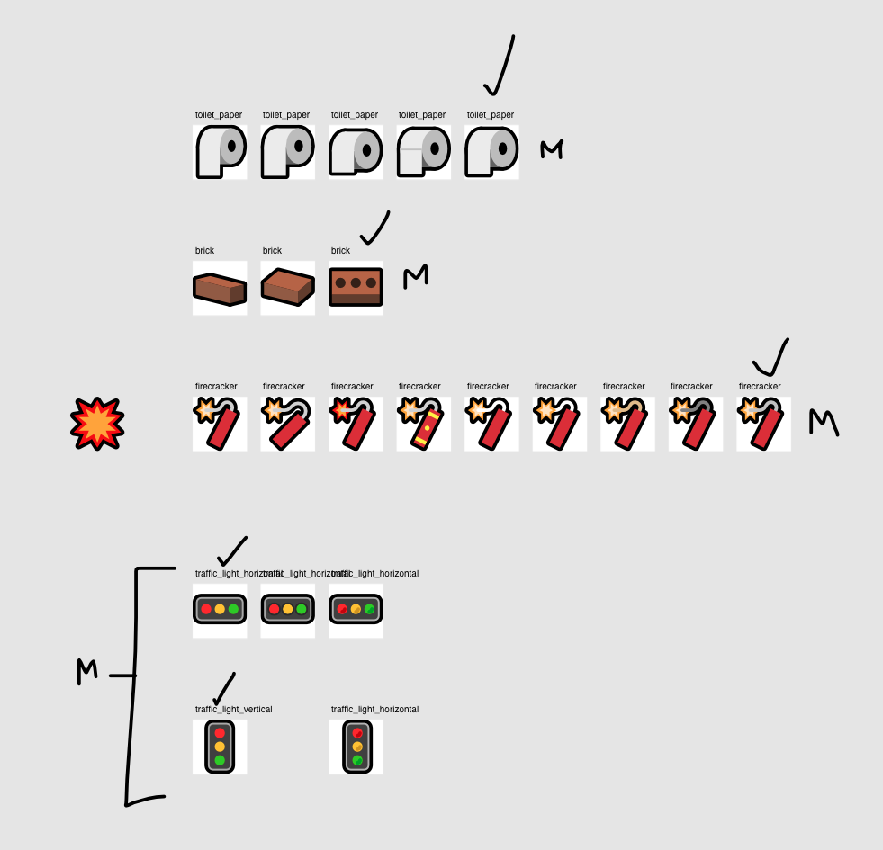
I was not prepared for how many sketches I had to publish for this.
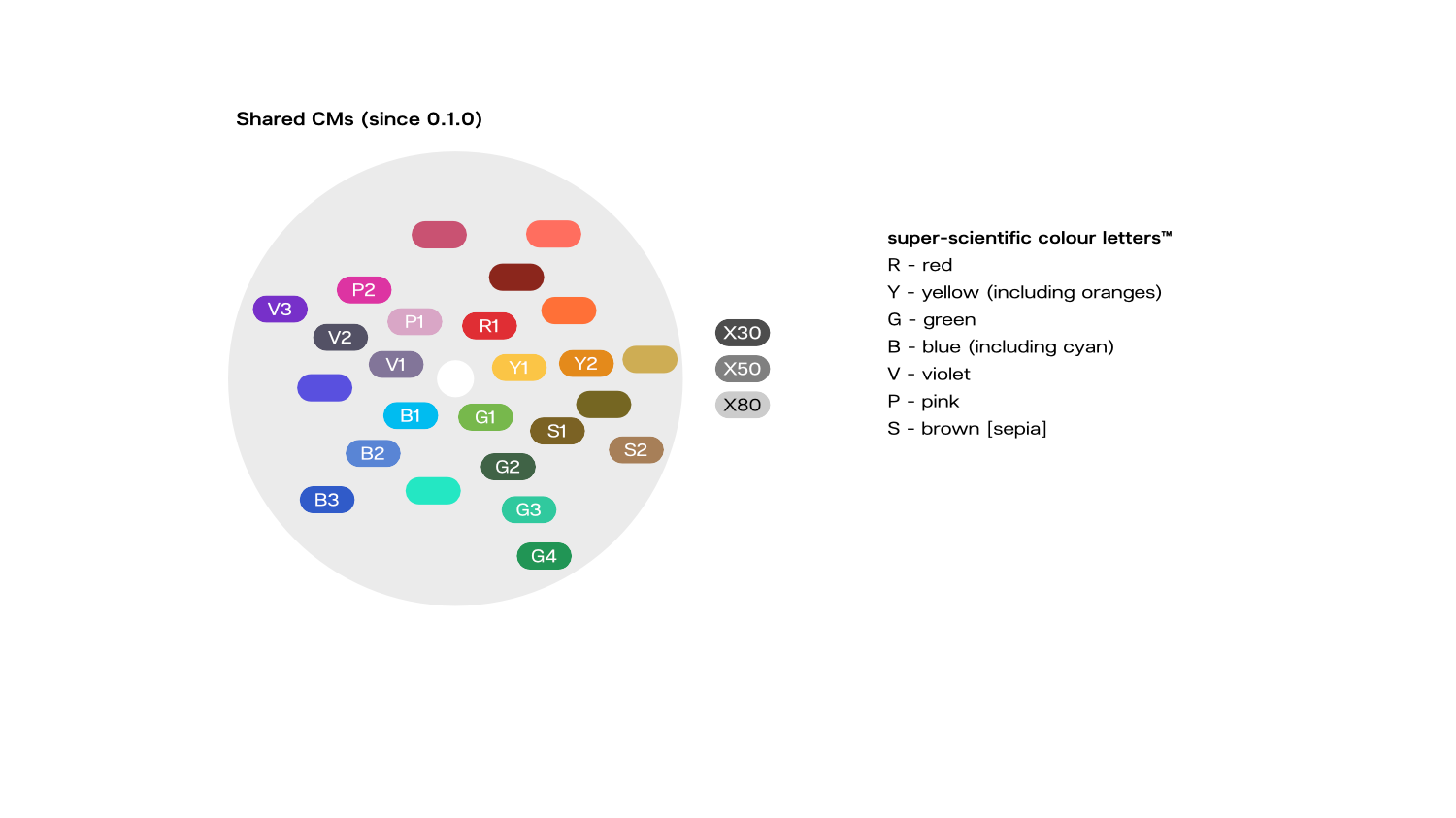
New Shared CMs
I’ve been experimenting with new CMs for many many many many months.
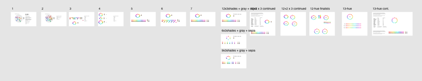
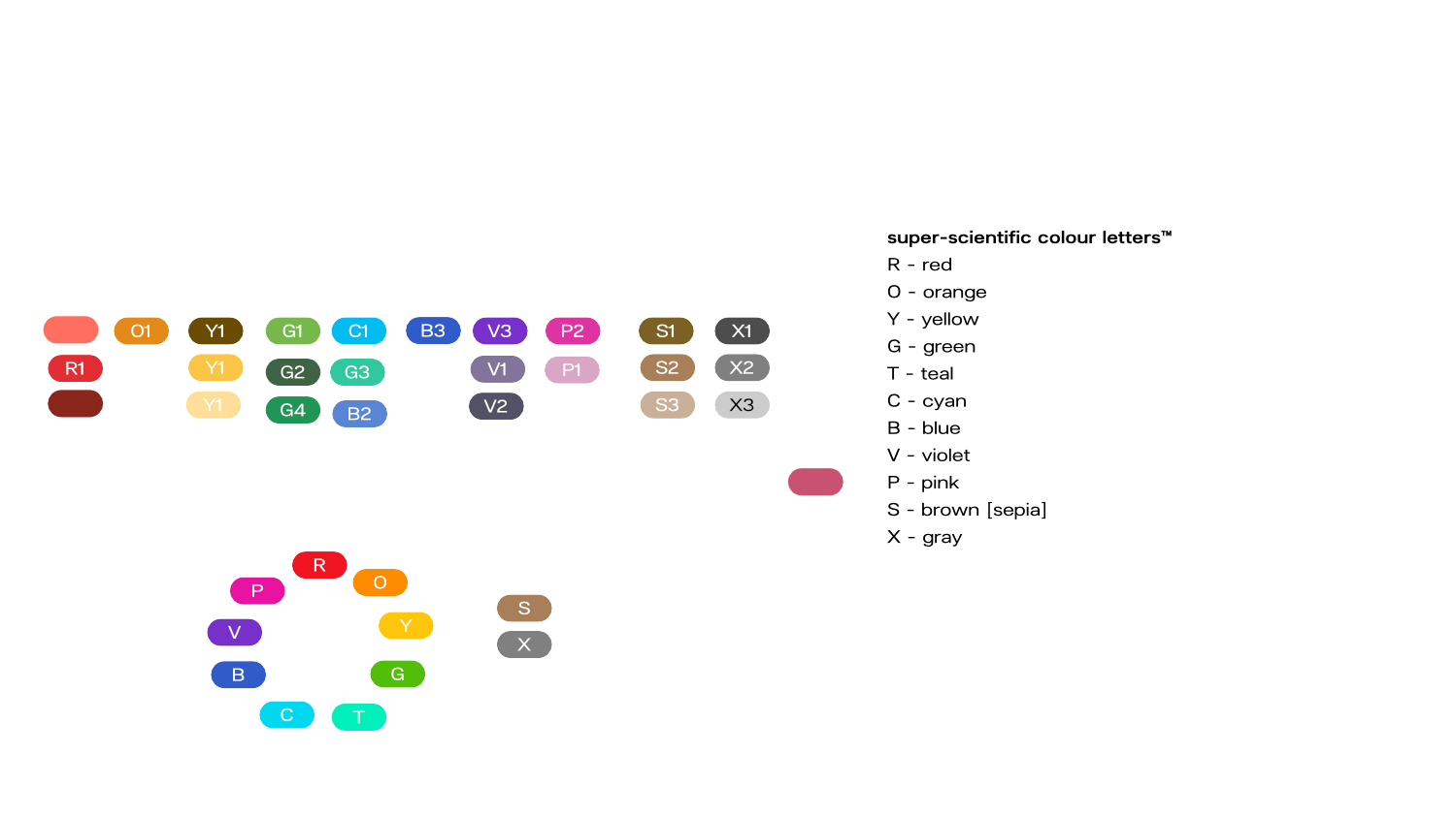
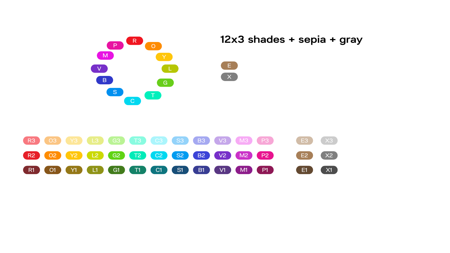
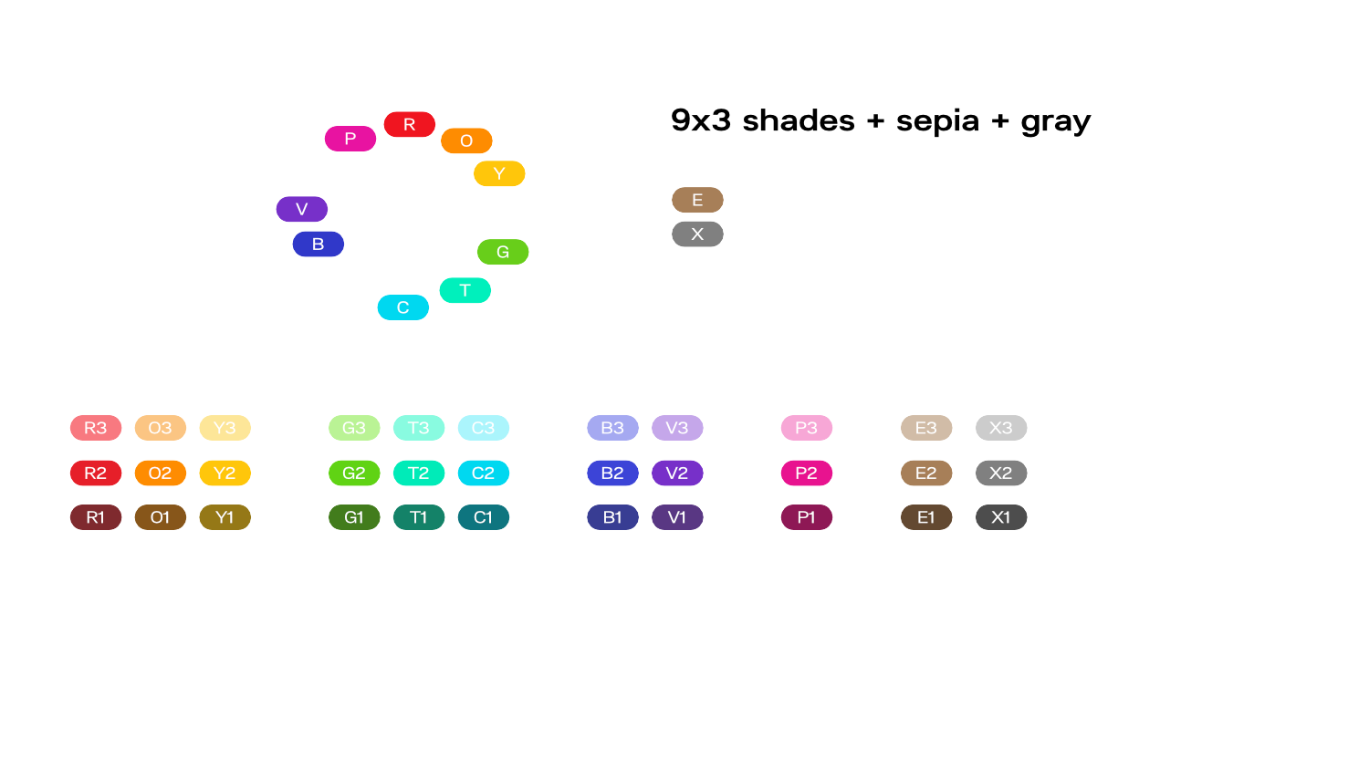
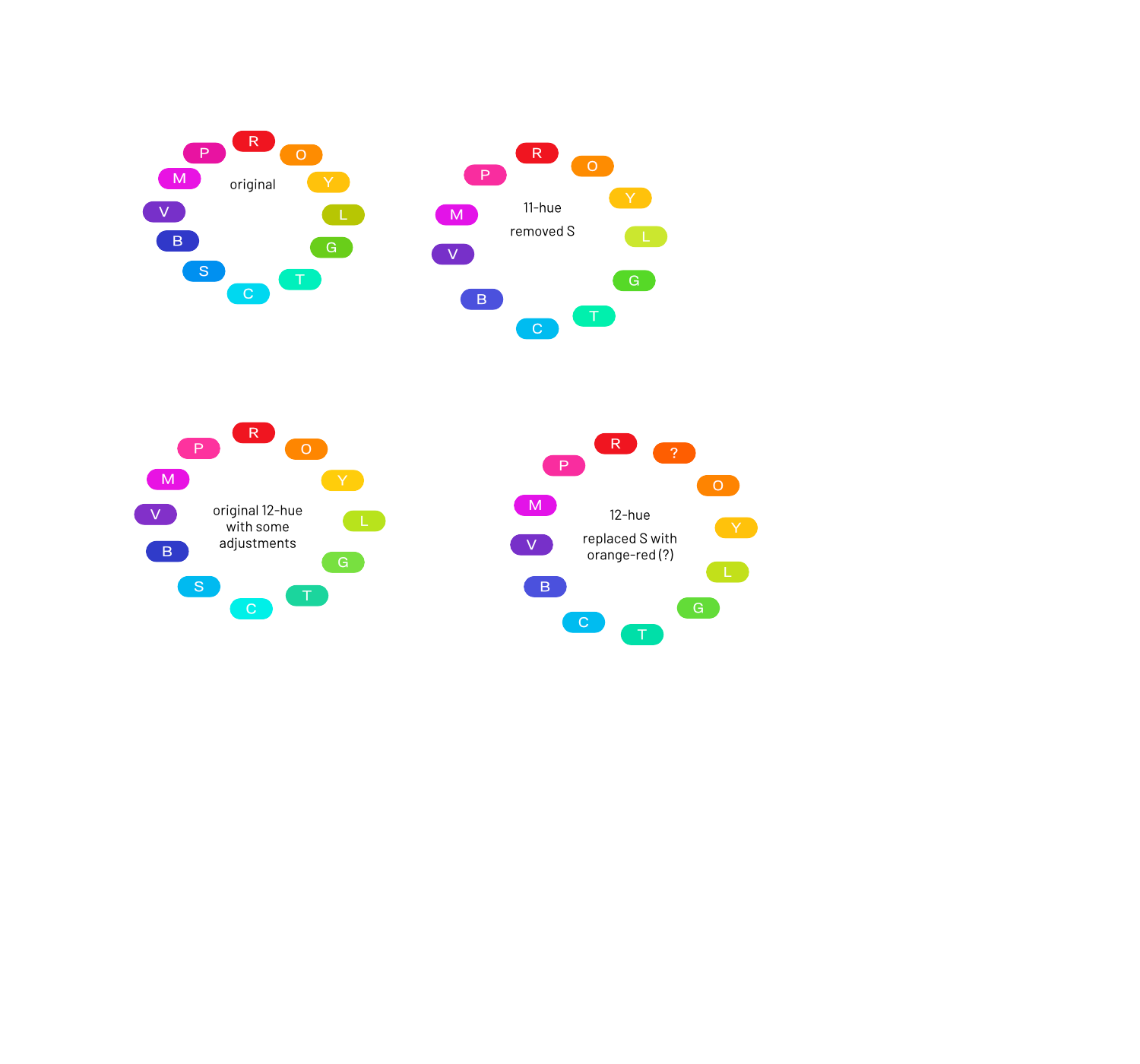
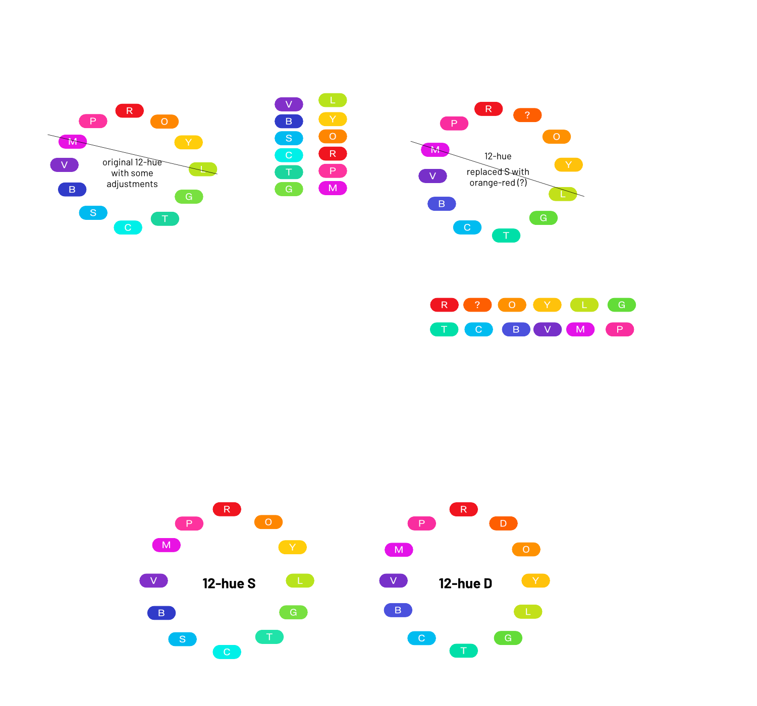
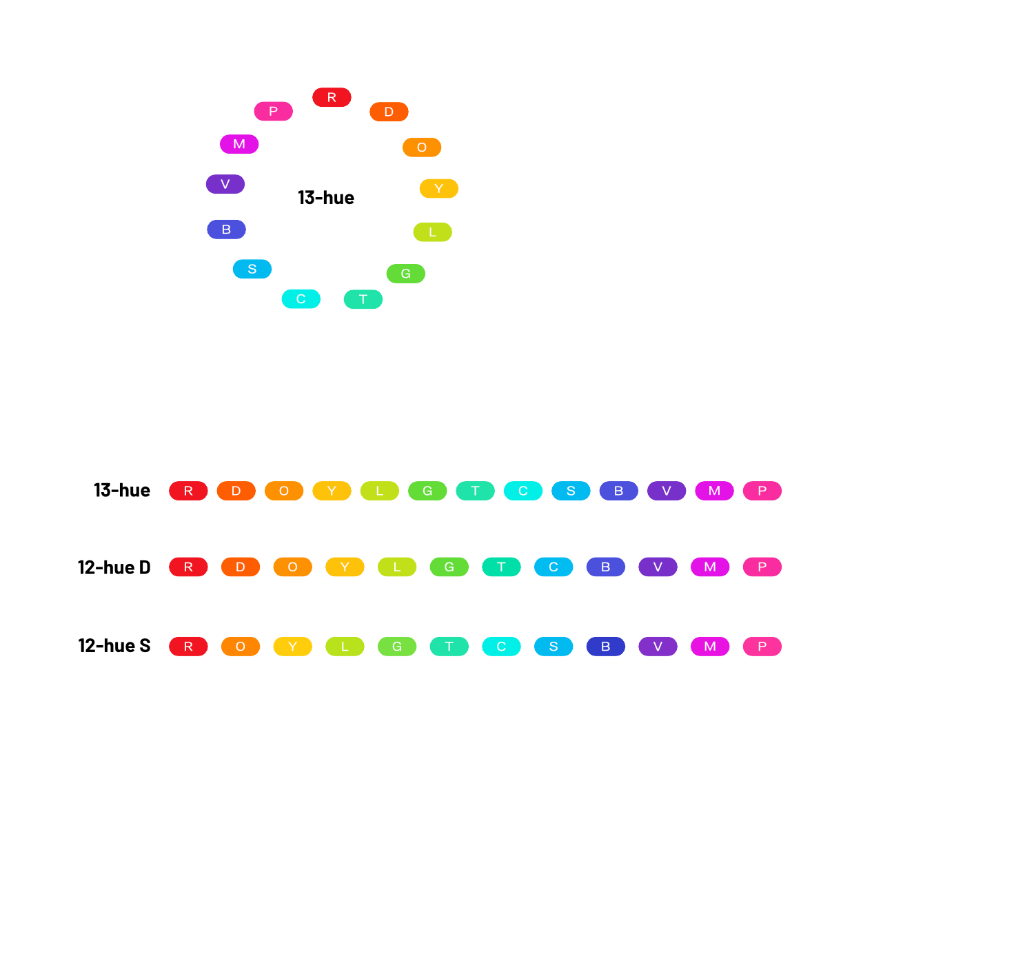
Originally, the way I made shared CMs was just picking random colours based on nonhuman things that had inspired me (Like the original G1 colour was kinda obviously a classic orc skin tone). Then in June/July, I got the idea that in order to really do this area justice, I need to have some kind of uniform system for hues and brightnesses, so I started making many sketches as to how I could possibly systemise it. I knew that I wanted between 32 and 48 colours.
Eventually after a bunch of different system experiments and feedback from the community, I settled on a 13-hue system (black cats, 13 hues, what next???). It doesn’t neatly fit into any numbered system, but it has a lot:
- A reasonably smooth hue distribution
- Distinct points that can be easily named in many languages
- A relatively even balance of cold/warm colours
- Base colours that are relatively moderate in terms of how much they differ from each other in brightness (that can’t be helped entirely, but I did my best to dampen it without making things dull)
- Could (in my head at least) be applicable to a wide range of nonhuman characters and hopefully can provide a colour with which someone can approximately express themselves with.

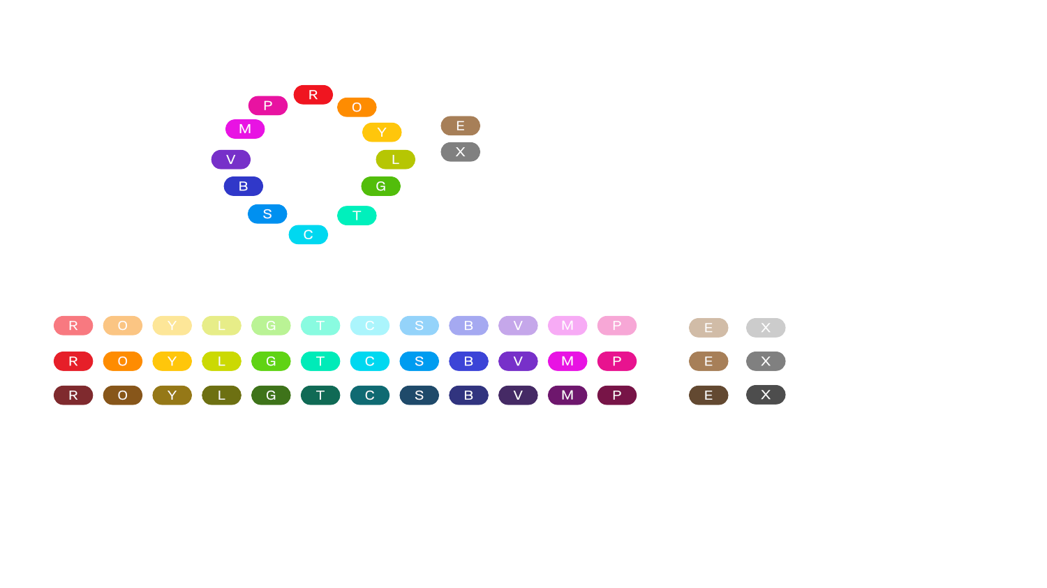
MutStd sketch 2017.08.21 – new skin tones
Yep, this is really old and I made this looong before I figured out the final system.
MutStd sketch 2018.07.09 – MutStd 0.3.0 shared CMs plan
All of the following are different artboards in the same file.

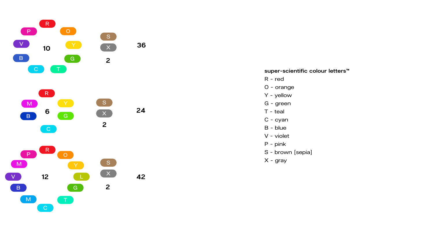


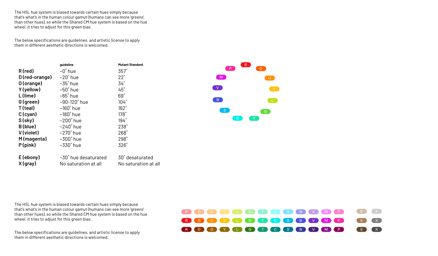
In some of these later experiments I wrote about them as if I was presenting them as part of a standard. (This will come back in the form of some Mutant Standard guidance in the future, for those interested in making their own emoji sets based on Mutant Standard’s encoding)
… and we’re still not done!
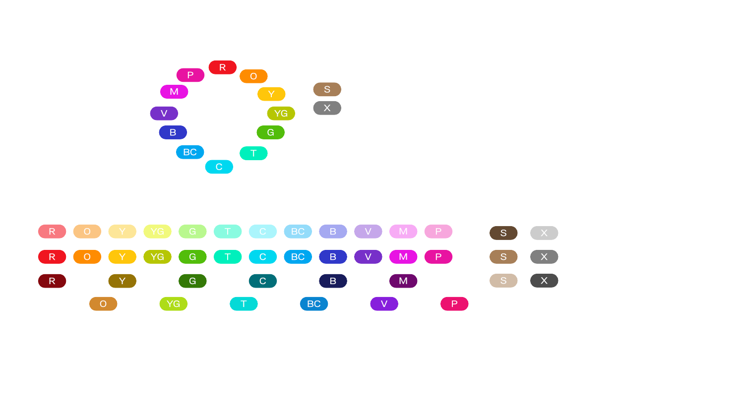
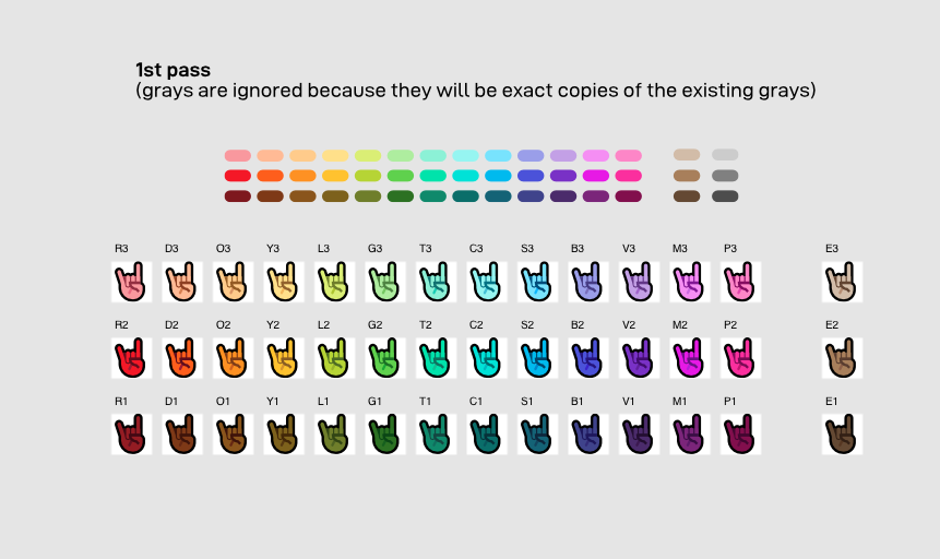
After figuring out what hues I wanted to do, I had to actually implement them into palettes (there are 5 unique colours for every skin tone), enter the hex colours into Orxporter, export them, test them and keep repeating until I was satisfied.
MutStd sketch 2018.08.14 – MutStd 0.3.0 Shared CM development
All of the following are different sections/artboards of this file.
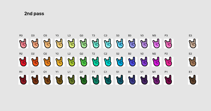
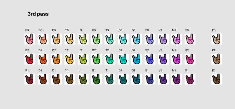
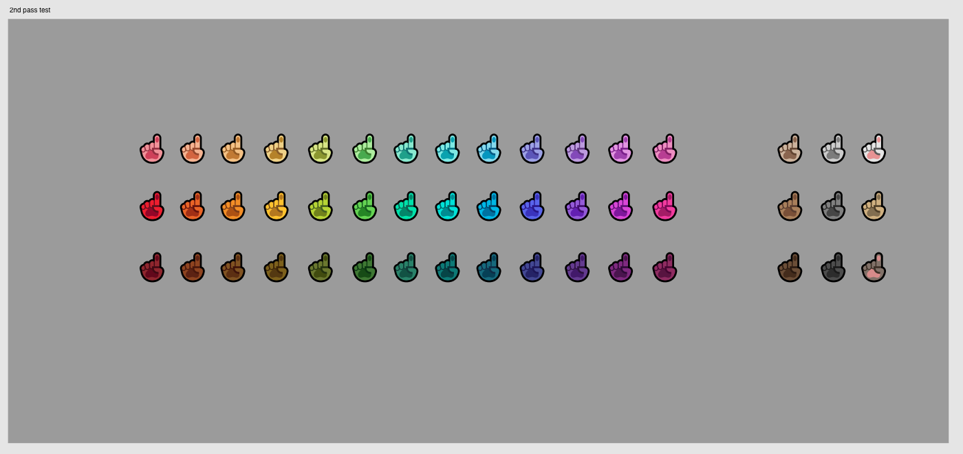
Creating the initial 3 ‘shades’ for every CM.
Every CM is comprised of 3 basic shades (‘Shade 1’, ‘Shade 2’, ‘Shade 3’) that give the emoji depth and shading. Each of these shades are specifically and meticulously chosen for vibrancy and visual consistency.
How meticulous? welll…
1st shading pass
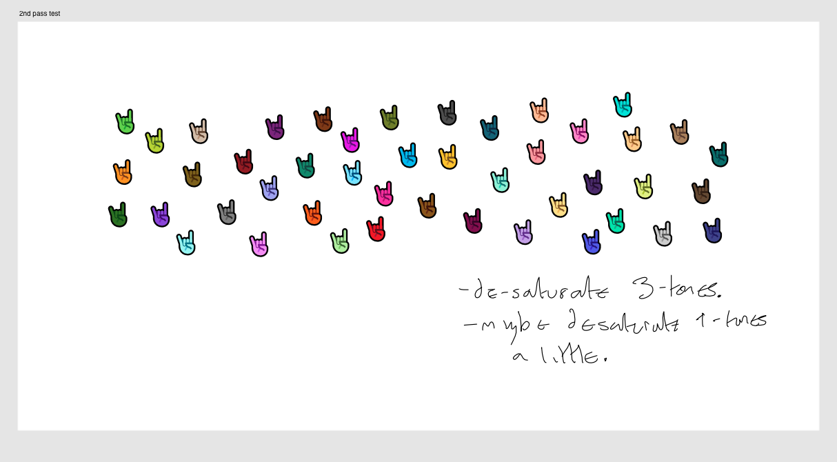
2nd shading pass
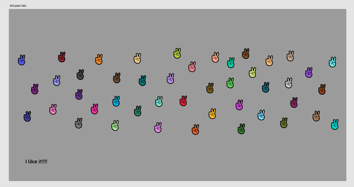
3rd shading pass
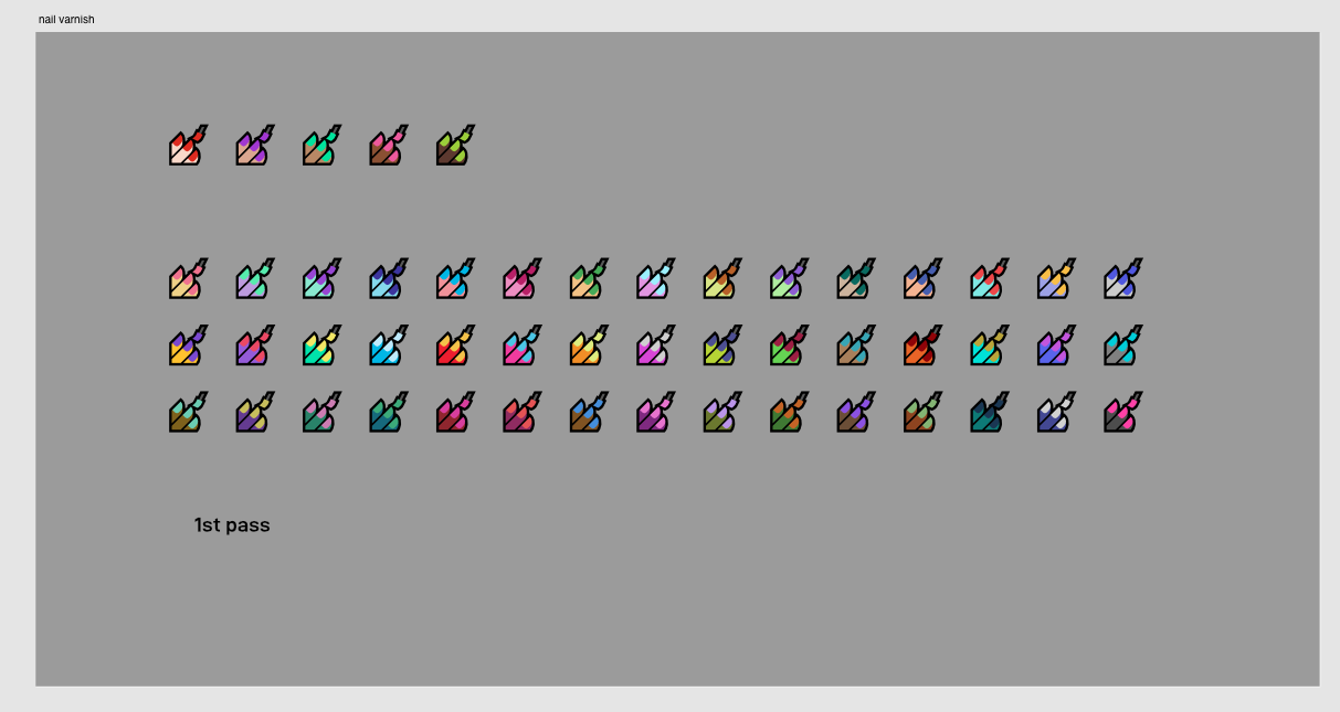
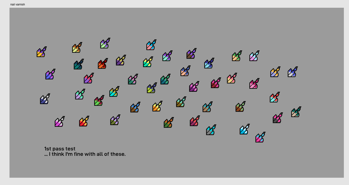
After that, as per Mutant Standard tradition, I had to come up with a unique complimentary nail varnish colour for every CM.
(the Human shades shown in the pass were there for reference)
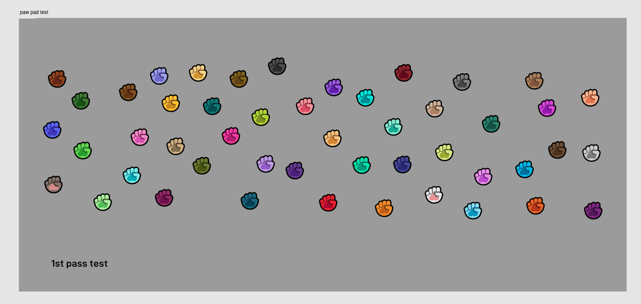
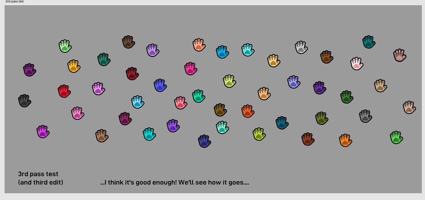
Then finally, the paw pad colour.
1st paw pad pass

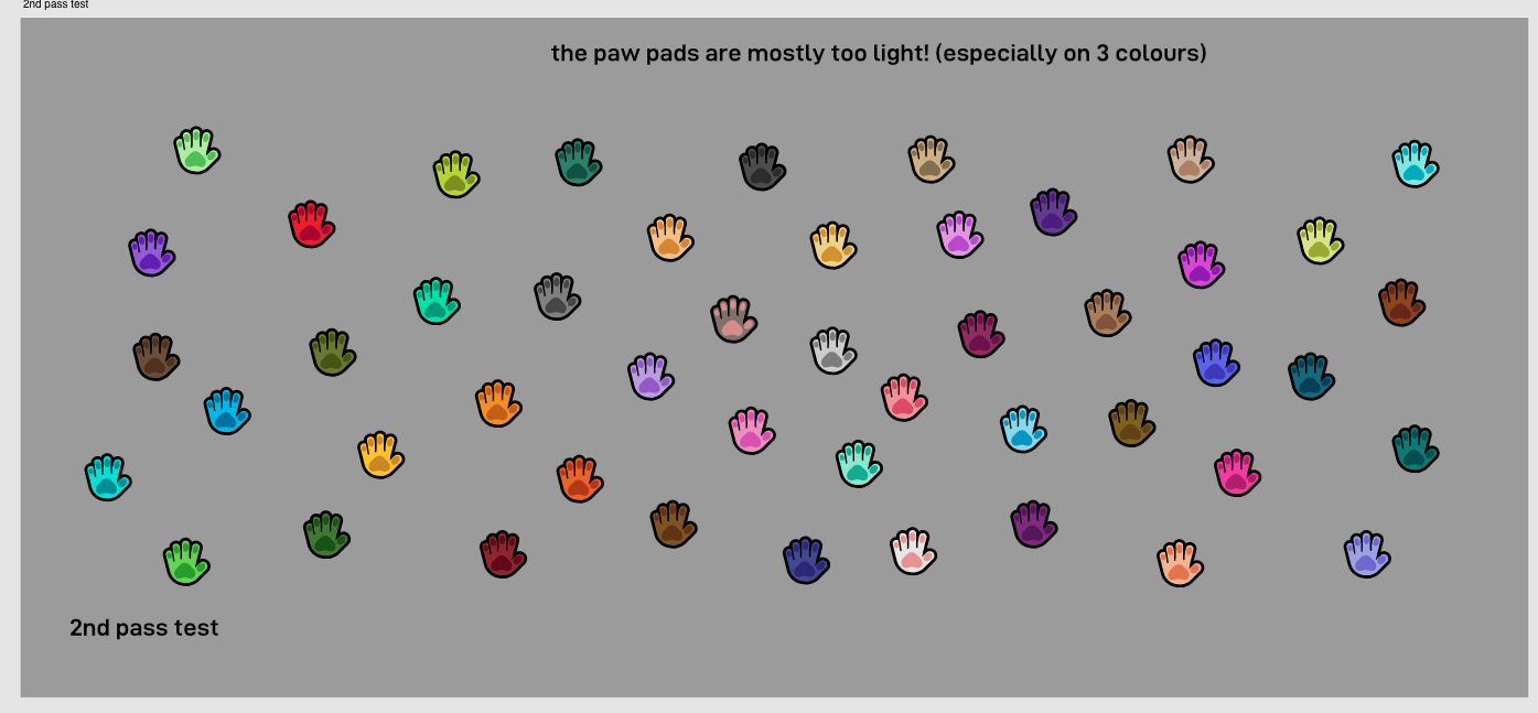
2nd paw pad pass
3rd paw pad pass
…and now it’s done!
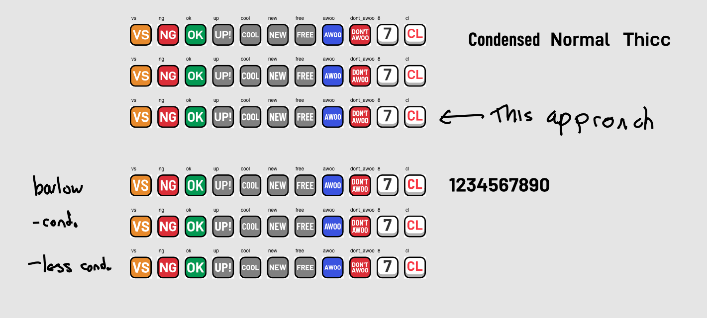
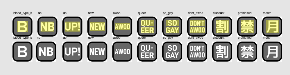
New symbol font
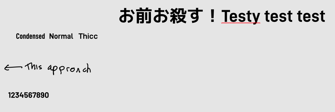
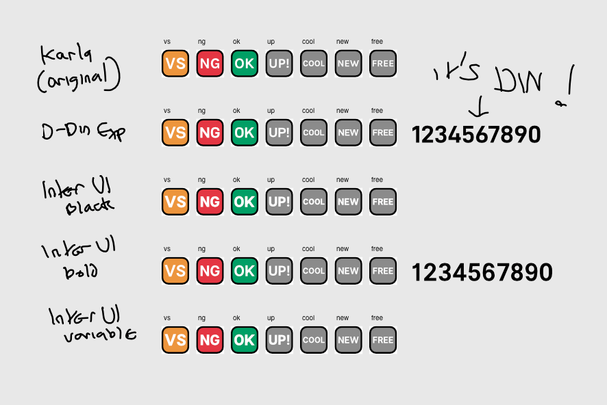
The Karla font on the latin text symbols was bugging me – it’s a nice font, I just didn’t like some of the kind of whimsical or retro-feeling curves and cuts, and I wanted to make the font more aesthetically in line with how I want the project’s aesthetic to be as a whole.
It was originally competition between three particular OFL licensed fonts – D-DIN Exp (which is upcoming as the body font for Mutant Standard’s light rebranding) and Inter UI. D-DIN won because I preferred the more straight-cut Os and zeroes, and I preferred the look of the numbers much more than Inter UI’s. I later tried it against Barlow, but found that the slightly rounded terminals didn’t fit the aesthetic very much.
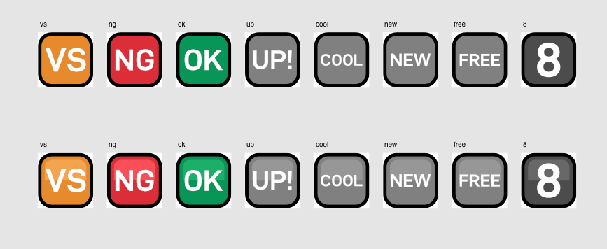
In addition, I did a brief experiment with having the boxes lit and shaded like hearts, water drops, clouds, etc. I felt it was a bit over the top and didn’t really fit with how I’m trying to approach shading (don’t use it unless it becomes absolutely necessary aesthetically or for readability/recognition).
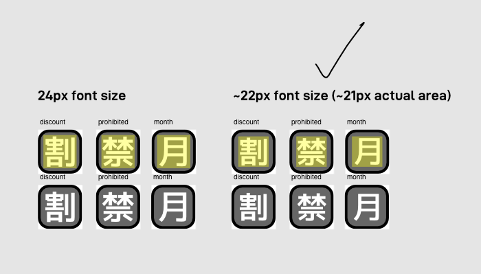
I wasn’t sure about what I did with the Japanese symbols where I made the less complex ones more bold than the more complex ones. In my experiments with applying that to Latin characters, it didn’t feel right, so I imagine that that also might not feel right to native Japanese readers, so I made it uniform for them.
MutStd sketch 2018.07.30 symbol palette revision
(gonna have to do this one in multiple chunks too)


Comparing D-DIN against the Japanese font to see if they work together okay enough. >w>
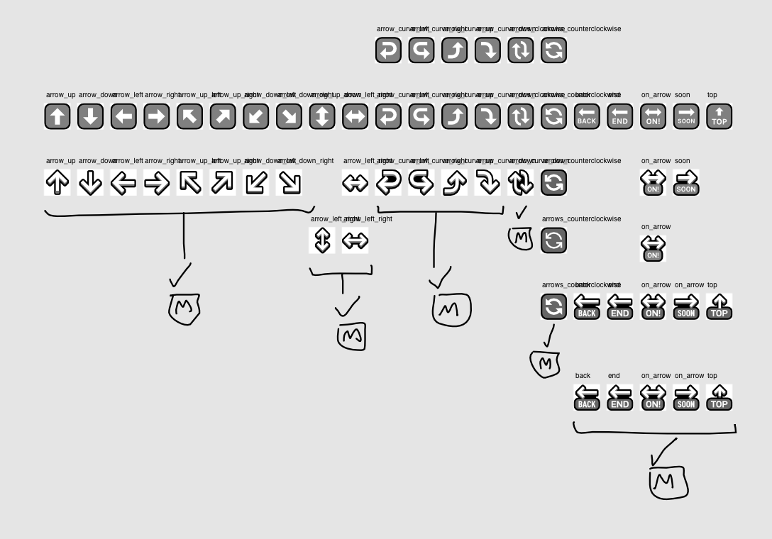
MutStd sketch 2018.08.05 character standardisation 1
Now that I had the fonts and colours, I decided to standardise the padding too.
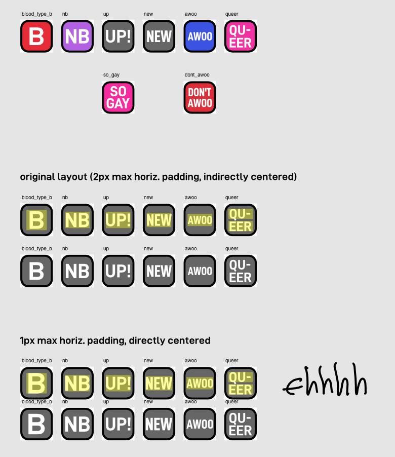
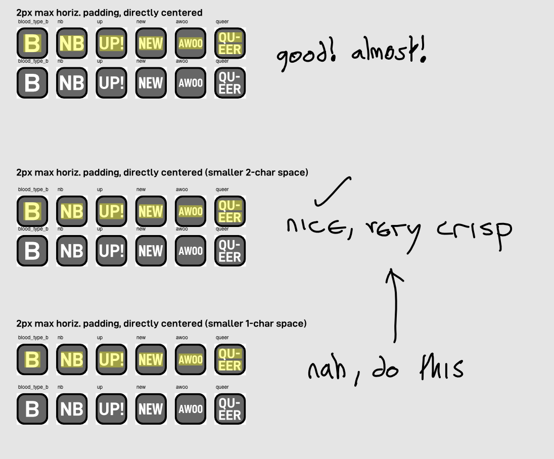
MutStd sketch 2018.08.11 character standardisation 2
…and standardise the Japanese padding
MutStd sketch 2018.08.11 character standardisation 3
I really like how they turned out and I love seeing the different font contexts and scripts all together.
Freed Arrows
Inspired by Xu Bing’s Book From the Ground art installations, I wanted to take the arrows out of the rounded box frame so they can stand alone and be used in conjunction/juxtaposition with other emoji characters to create more expressive potential.
MutStd sketch 2018.07.30 symbol palette revision
Back to this file briefly! (which was where all of the symbol font changing stuff happened).
In this file I did an initial test to see which style I should use.
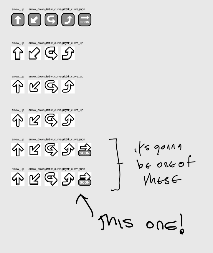
MutStd sketch 2018.08.03 new arrows
In this file I created new designs for all of the arrows. I even took on the condensed font technique from my text symbol experiments for the ‘BACK’, ‘ON!’, etc. arrows.
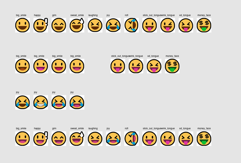
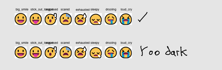
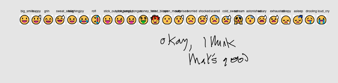
New tongues
I want to come to a close on the smiley designs as much as possible. While I was super happy with the smilies after the refresh in 0.2.4, the mouths were a sticking point – they felt a bit vacuous and they lacked the depth that I felt was necessary to really parse them well. So in this version I added tongues. I also made the mouth insides pink because dark yellow didn’t feel right.
MutStd sketch 2018.07.31 open mouth smiley improvements
All of the following are different sections in the same file:
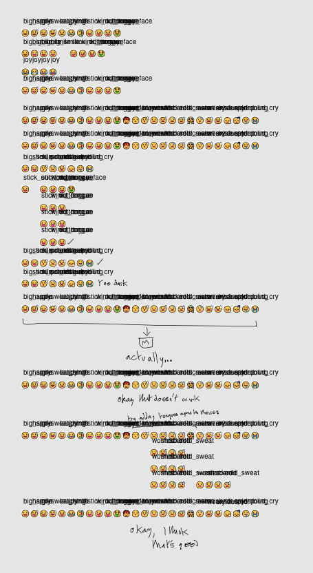
I barely annotated this one at all. I’m so sorry.
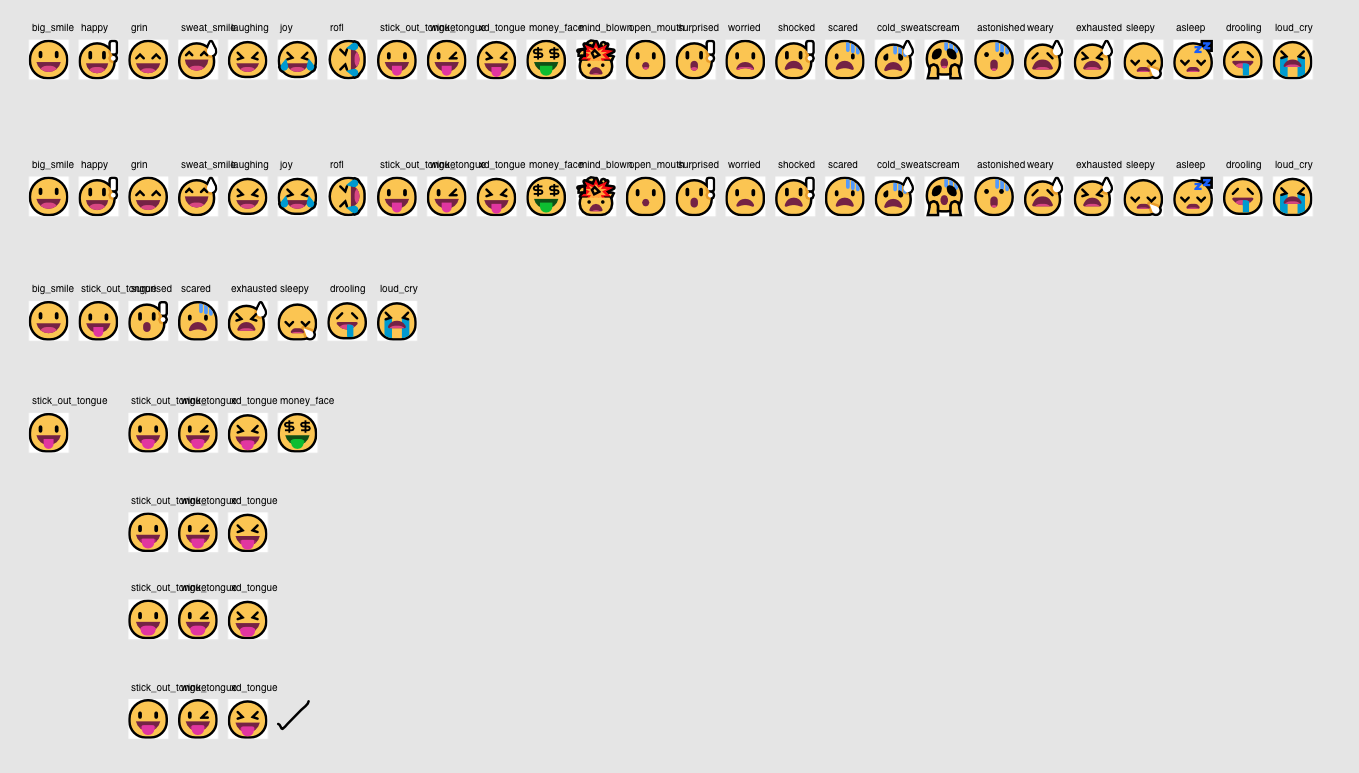

Improved objects
As I was in the neighbourhood so to speak (because I had to edit the font on the date and calendar emoji), I fixed some long-standing aesthetic and anti-aliasing issues with other emoji in this area.
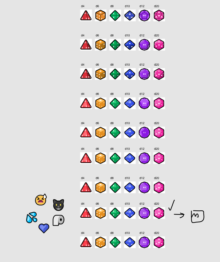
MutStd sketch 2018.08.20 Revised dice
The inner outlines made the emoji feel flat and dull, so inspired by sweat_drops and the hearts, I devised a completely new shading method, as well as switching the colours to the new symbols palette.
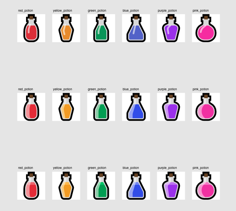
MutStd sketch 2018.08.21 Potions improvements
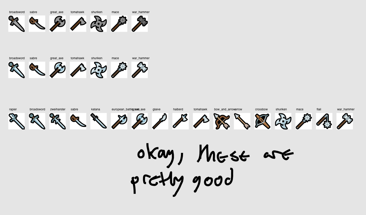
MutStd sketch 2018.08.20 Weapons improvements
New stuff
MutStd sketch 2018.08.03 gay sign concepts
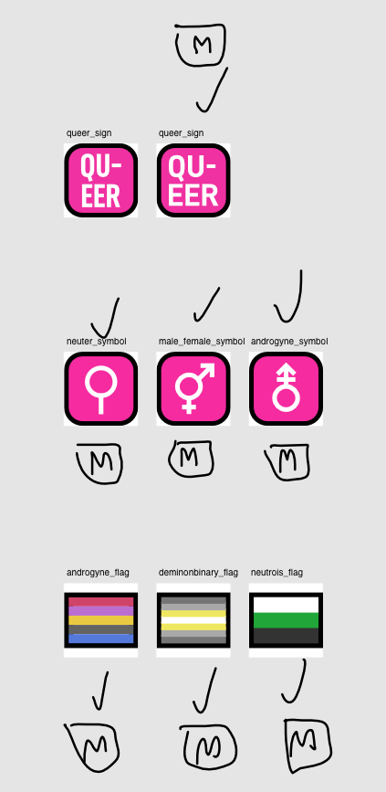
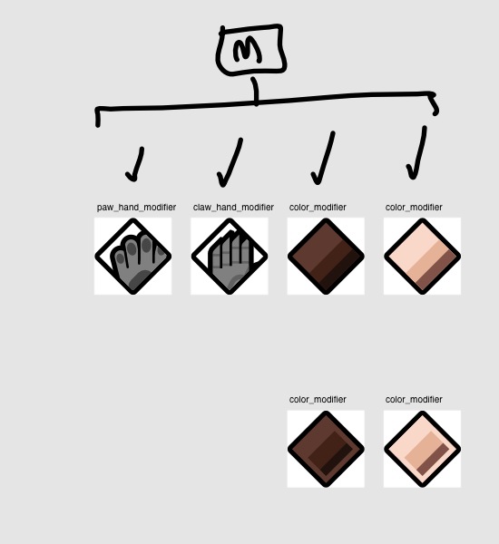
MutStd sketch 2018.08.07 Modifier symbols
Because this version introduces PUA encoding and PUA modifiers, I had to come up with some placeholder glyphs for the possible future where Mutant Standard has fonts and some ZWJ has broken down, revealing it’s parts.
MutStd sketch 2018.07.25 my fave objects