I’ve been in the merch game for quite a while now, and I thought it might be cool for those interested in using sites like Redbubble and Society6 to give insight based on my experiences so far.
Ask yourself whether these services are worth using in the first place.
These services are a bit of an Uber, but arguably worse – in order to do this, you’re probably going to put quite a substantial amount of labour in the preparing and upload process (and design, if you haven’t made designs already) without the guarantee of any return, let alone a satisfactory one. Ask yourself whether it’s actually going to be worth that labour for you compared to something else you could be putting it into.
IMO, the answer probably depends on what kind of audience/fanbase you have for your work. Don’t expect the discovery tools of the store to assist you with sales, because popularity is the typical metric for how likely you are to be discovered and there are a lot of people posting stuff on these services. Throughout the ~6 months I’ve been selling, I can guess with a reasonable amount of certainty that nearly all sales came from my audience.
Be mindful of what your cut of the sale is
With Redbubble, you decide what profit margin you get from the final product in all product categories. This is pretty nice because you can assert how much it’s worth to you. I’ve selected a profit margin that gives me slightly less than 25% of the product cost, and that is satisfactory to me.
With Society6, with the exception of certain art prints, you can’t decide the profit margin, and the cut you do get is pretty terrible in my opinion (10%). I made the mistake of investing time to make Society6 products before seeing this, but some of their products seem nice and they offer things Redbubble does not so I’ve decided to go along with them as a secondary place for now and making the cut clear to my fans on my website so they can make the decision that suits them.
Look at the cut the site is offering and decide if it’s worth it before deciding to do anything at all with them. If the cut is something you can decide, choose something that you feel comfortable with.
If you just want to sell stickers, consider getting stickers printed yourself
If you want stickers, ask yourself if it’s worth using these services or if you can afford to print yourself. You can go to independent print shops to get them done in bulk instead and sell them via a merch platform like Tictail or Storeenvy.
I use Redbubble and Society6 because I don’t have the starting money to make print orders or the physical space or mental energy to manage merch shipping at this current point in my life (and there are just so many emoji that it makes deciding what to print and what not to print difficult).
But if you have some money to do it, and you know you’re going to get at least some sales, printing it yourself is better in a variety of ways:
(keep in mind I haven’t done this myself, so I don’t know what the experience of this is like in detail)
- More profit (because you’re taking over more of the production and handling process, and you’re printing in bulk beforehand instead of on-demand).
- More control over your sticker selection, sticker size, sales, pricing, bundles, etc. (Society6 and Redbubble’s minimum sizes are pretty large and I really want to offer my emoji stickers in smaller sizes but I can’t.)
- Control over where you sell. (You can sell online and at conventions)
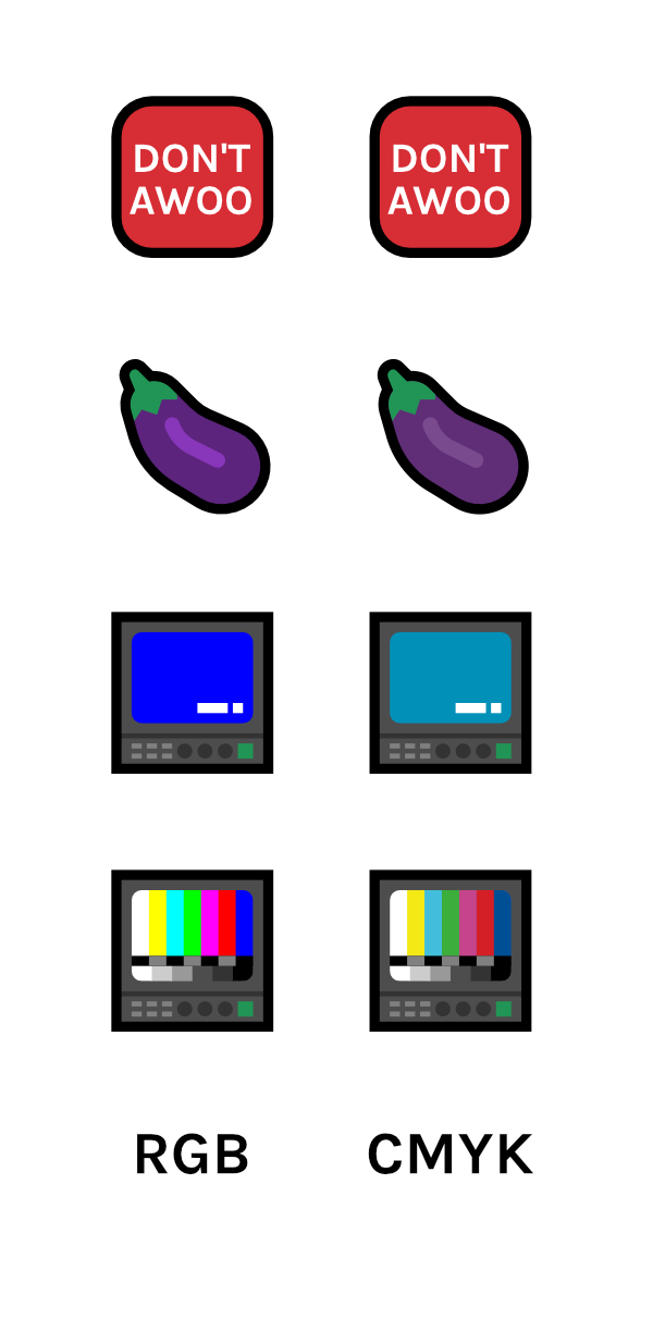
- The stickers will most likely be better quality – you can actually talk to your printers, ask about their production equipment, you can ask what colour profiles they work with and tailor your colours so they look super-good. Stores like Society6 and Redbubble don’t have specific colour profiles, you can only go with a generic CMYK profile (which is saved as RGB even — more on that later.)
If I had the resources to print my own stickers, I personally would.
Work in CMYK, manually convert to CMYK if you’re coming from RGB

If you’re like me and you normally make stuff in RGB colour space, you should make separate duplicate files in CMYK.
Your illustration app of choice will get you part of the way there when you convert your duplicate file to CMYK, but they aren’t capable of making CMYK really pop, which means you will need to get manual. CMYK is inherently less vibrant (especially with blues/purples) so what looks good in CMYK won’t be the same as what looks good in RGB, and you will need to be willing to shift some hues around.
You don’t get specific CMYK colour profiles (ie. US Swap, Japan, FOGRA, etc.) on the printing places I use, so go for a ‘generic’ CMYK colour profile.
The more technically savvy of you may have figured out that wait – you’re giving the site PNGs, and PNGs only accept RGB colour space.
So the colour conversion process looks a bit like this:
- You make the file in CMYK colourspace
- You export as RGB PNG
- The site gets the RGB PNG
- The site converts the RGB PNG to CMYK again at print.
It’s weirdly convoluted, but making sure you are working in CMYK in the first stage means your printed stuff will look the best you can possibly get them when they do hit the printers, even if colour accuracy guarantees aren’t excellent.
Use reusable templates and assets where you can.
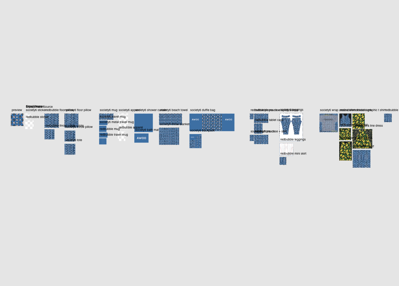
You will (presumably) be making merch for the same formats – each printer has their own formats. Make a reusable template with those, so you don’t have to set everything up every single time you want to make something.
Using assets, symbols and swatches can speed up the process quite a lot as well if you’re like me and put certain repetitive symbols on products.
Affinity Designer is super helpful for this because in addition to assets and symbols, it has a really powerful export system with a lot of automation features.
Avoid using the positioning and scaling tools on the upload if you need precision.
It’s fine if you’re just uploading a wrap-around pattern that has no precision, but if it does, or if you need to center or align a design accurately, don’t use it.
Look at the store’s image dimensions for each product. Make your template for that product in advance at the exact size so there’s no room for error. Then all you need to do is drag and drop the right file for the right product type.
Be very conservative with the amount of time uploading will take.
The upload tools of Redbubble and Society6 are slow, and you will probably upload the same product file multiple times so you can get an idea of what they will look like on the preview.
There is no batch upload, there is just lots and lots of checking and clicking and dragging.
One file for one product line.

Not every app can do this, but if you can have multiple artboards, make a file with one of each artboard for each type product that you want to make for. Then fill the artboards with one design, and export out all at once.
It makes your file organisation easier (because you have one file per product design) and means you can export all items for that particular design in one click.
Consider how 3D objects might affect the appearance of your designs.
For instance, I add more padding for my pillow designs because otherwise text and symbols will warp too much towards the edges of the pillow for my liking.