Sorry for the delay on these! I got kinda absorbed in just making emoji the last two months. Here’s the sketches for the last four releases (each version will be their own individual post).
CW – Most of the emoji here are food and alcohol emoji.
MutStd sketch 2017.10.07 – negative symbols
These designs had been sitting unfinished/undecided for a long while now, and I just decided to put them in the set because I couldn’t think of another angle at the time. I think in the future, I might add some depth/lighting to some of these.
(Also in the actual master files I realised that what I called spiky_stop_sign wasn’t actually that and it was a Japanese name tag symbol. Welp.)
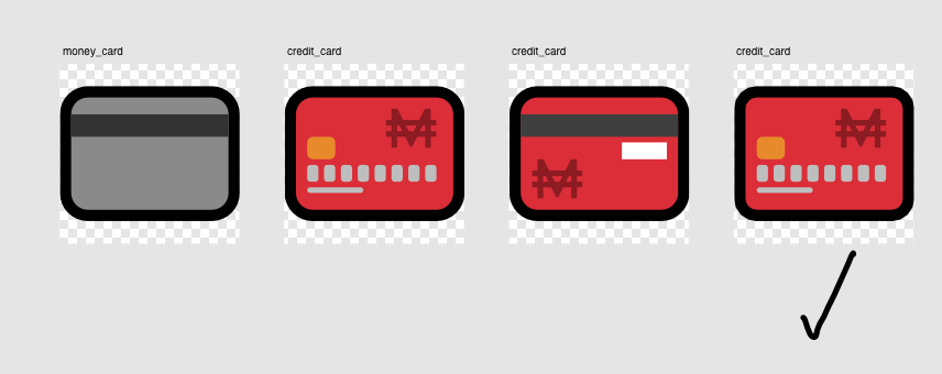
MutStd sketch 2017.10.15 – credit card
This one has also been in limbo for quite a while. It was originally just the unfinished gray block with the stripe, then in this version I decided to get them out the door and finish it. As per Mutant Standard tradition, it uses the same ‘M’ imaginary money symbol as the rest of the money emoji.
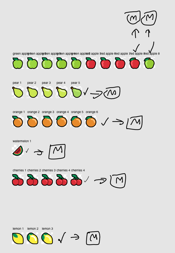
MutStd sketch 2018.01.31 food and drink
(This is a big one, so I’ve split it across multiple screenshots)
Lots of leaf adjustments here. I still think the apple could do with more work, but I like where I ended up with the design of the leaf there.
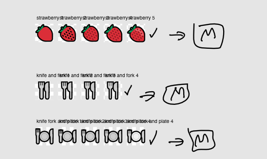
The strawberry was a bit hard to make and it looks a tad weird and flat, but I’ll work on it more later. Not much else to say apart from that!
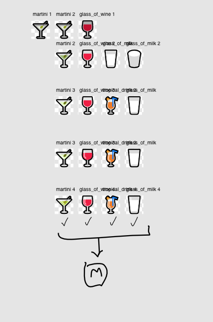
I’m not that happy with the results of these, but I felt they were good enough to go. It’s just the shine on the glasses feels off in terms of aesthetics right now. Also the glass of milk might not be that recognisable, but I don’t think I’m the only emoji vendor to find difficulty there.
MutStd sketch 2018.03.25 other food
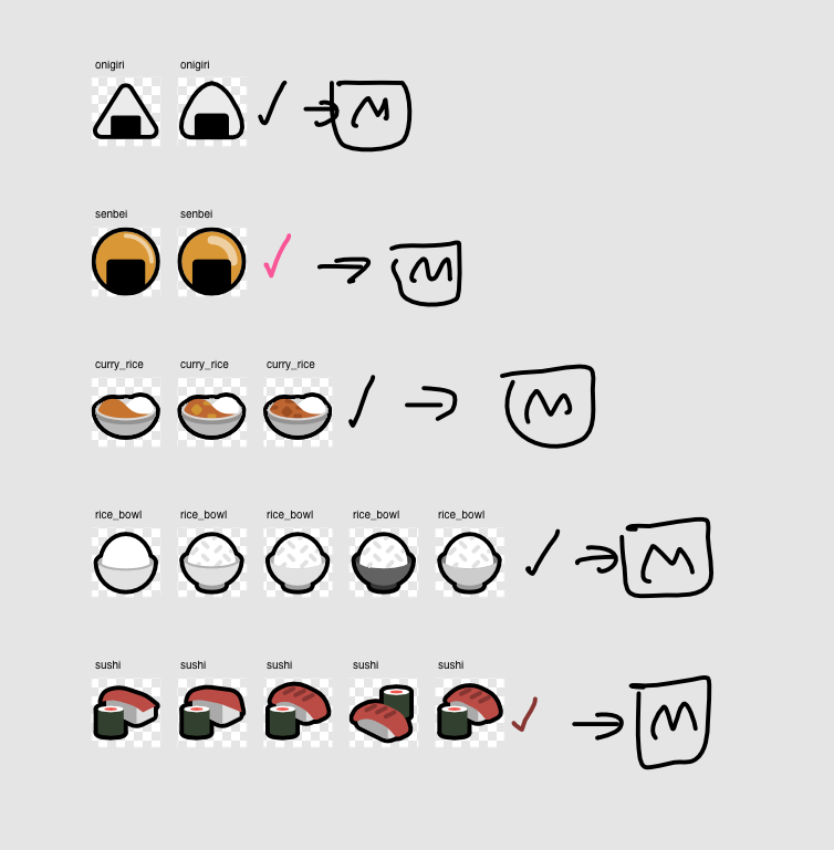
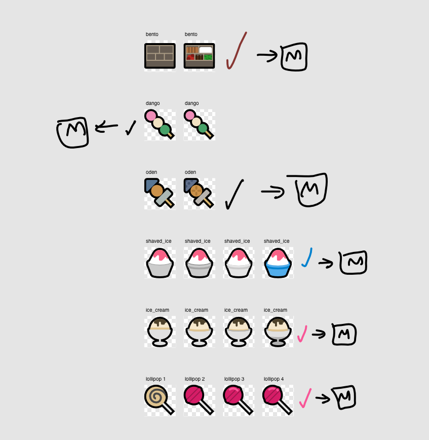
This sketch file was mostly for Japanese food and drink and desserts.
As with shortcodes for emoji with Japanese characters, I’ve opted for an approach to shortcodes for Japanese food that tries to not make it convenient to westerners for the sake of being convenient and to encourage cultural curiosity.
So while with the symbols, I tried to roughly translate what the kanji/kana meant in the contexts they were implied for, here I’m generally remaining faithful to the names of these foods as they are known in Japan.
(This is a big one, so I’ve split it across multiple screenshots)
I like how some of the abstract patterns I developed for fruits prior (like the melon) have come back here (in curry_rice, rice_bowl and sushi) to add nice abstract texture that isn’t too detailed and feels very at home with the aesthetic I’m trying to create.
The simplistic textures make a comeback in oden. I also deviated a bit from traditional lollipop emoji designs (which are normally big swirly ones) in favour of a small spherical lollipop that most people are used to actually eating.
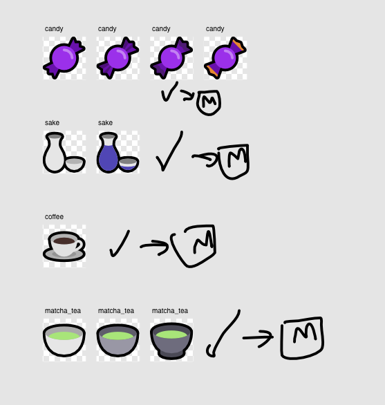
The candy is purple here! I just wanted a change and mix up the colours in the set. In hindsight, it makes me think a lot of Quality Street‘s purple chocolate, IDK if any other Brits see it that way too.
None of the other designs here were that difficult or deviated much. I enjoy the graceful curves of the coffee cup a lot though.
MutStd sketch 2018.03.29 – red umbrella, privacy
These were relatively straightforward. red_umbrella mainly came out of a frustration with FOSTA/SESTA, but it was also something I had been thinking about for months.
I don’t know if red_umbrella will stay as a ‘symbol’ separate from the typical umbrella. It might get merged into umbrella, in which case it would maintain it’s redness and therefore maintain it’s symbolic integrity and meaning.

