Here’s part 2 of me trying to give you an idea of how I make emoji, so you can really understand the process pics that I will be posting soon.
Because Mutant Standard is a project where I’m constantly making little pictures, a production pipeline is needed to make this run more smoothly. It helps me to spend more time creating stuff than wondering where I should put everything. This wasn’t something I came up with on day one – it’s something that has taken all this time to come up with and refine and improve. I’m quite happy and settled with it as it stands right now, but things might change in the future.
If you wanna make your own emoji, you don’t necessarily have to think about everything I say here because this is designed to help me make hundreds of emoji and you might only want to make a few, but there are ideas here that are probably worth thinking about whenever you decide to make your own emoji.
Here’s an overview of the steps:
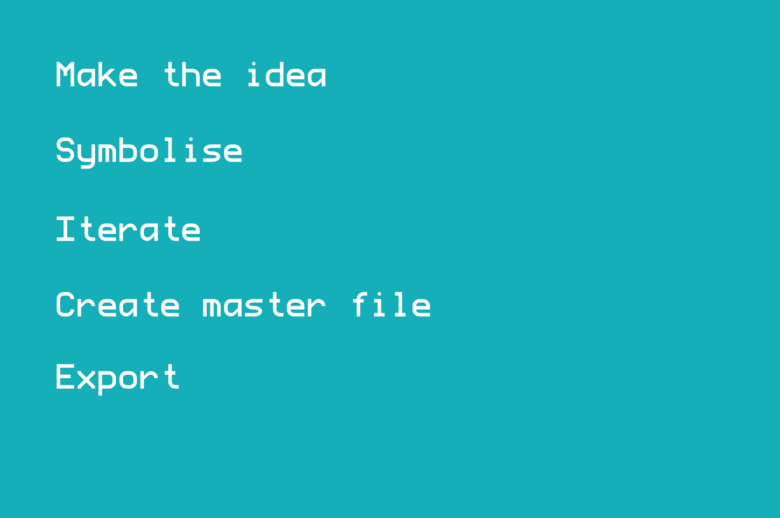
Make the idea
 ### Throwing blades - `shuriken` [Shuriken - Wikipedia](https://en.wikipedia.org/wiki/Shuriken) ### Hammers? ### Mace(s?) ### Projectiles - `crossbow` [Crossbow - Wikipedia](https://en.wikipedia.org/wiki/Crossbow) - `bow_and_arrow` (in UniStd) - `arrow` (not in UniStd?) ### Modern firearms - `grenade_launcher` ### Fantasy Items - some kind of bag? ## Symbols + empty heart + half heart For making fake heart-based health bars."](https://blog.mutant.tech/wp-content/uploads/2018/01/Screen-Shot-2018-01-23-at-21.01.08.png)
This is only a step if it’s an emoji idea I’m coming up with. If I’m dealing with Unicode emoji or something else, then this step doesn’t exist.
This is where I think about the abstract entity or object or whatever that I want to make an emoji out of. So this is where I make the decision in the first place to do tarot cards, rune stones, CRT screens, goblins, flaming turds and so on.
I generally don’t do drawing at this stage. Sometimes I’ll do the next stage and symbolise it only to come back to this if I’m not keen on how things are going.
In this stage, I think about things like:
- “How many people do i think would find this symbol useful or would enjoy using it?”
- “Have I made something before that’s similar to this?/How distinct is it from something else I’m planning to make?”
- “Is this a bit like a meme, or could I see people still using this in 5 years’ time?”
- “How does this fit among the other emoji I’ve made?”
I know that Unicode try to shoot for longevity and utility via popularity too. I don’t take it as seriously as they do, especially because of the way they do their decision making process kinda systematically leads them into normavity, and you know, Mutant Standard is decidedly not that, but it’s still important to think of whether the groups people I’m aiming to cater to will find what I’ve made useful enough.
Some of these questions don’t always have clear answers, so I’ll just go with my gut, really, or postpone it to think on it later. Sometimes I’ll just make it and see how it lands and give myself the space to retire an emoji later if I really think it’s worthwhile.
Symbolise
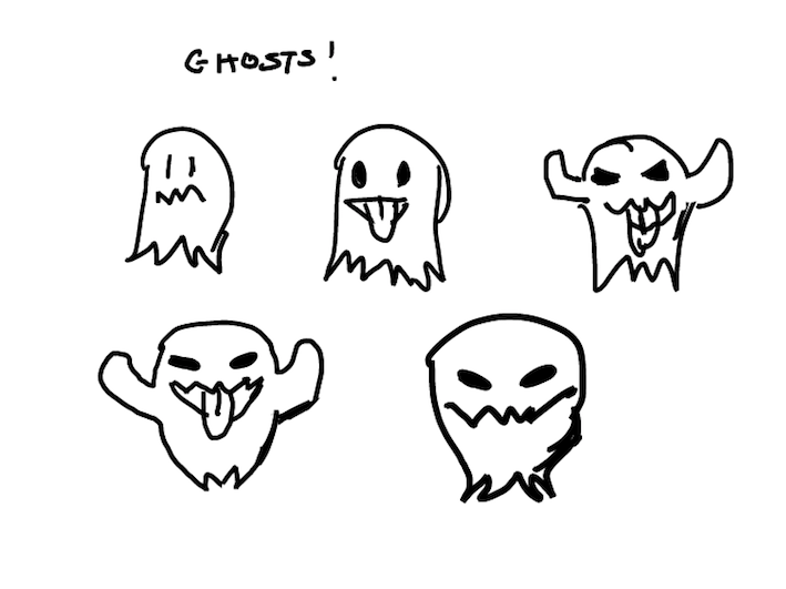
This is where I try to come up with the visual symbol for that emoji idea. Coming up with a symbol for something is different to (although partly the same as) just drawing it, because to symbolise something is to draw something in a particular way and with a particular usage or intent in mind.
Sometimes, the material I’m dealing with is already a symbol in itself (like a pride flag), in which case, I just move onto the next step.
There are many ways you can interpret a ‘thing’ or a ‘concept’ into an symbol or icon (which is what all emoji are, in essence), and when I consider these possibilities, I tend to think of things like:
- What symbol communicates the idea/object in the clearest way?
- What symbol suits the aesthetic of this set the best?
- What symbol emphasises the visual details that I think are most important to include? (versus the things that are less important)
- Is there a symbol of this that everyone already recognises so much that it would be a bad idea to do something different? (unless there’s a socially/culturally important reason for doing something differently, or I think I can do it better while maintaining recognisability)
This is really something I could get into more (and would like to some day). The process of iconography and selective visual detail is kind of a subtle art.
Deciding whether or not a Unicode emoji symbol is going to be more directly inspired from someone else (namely, Apple) or going to be something more self-directed is kind of a fuzzy line.
People are so used to the way a particular emoji idea or particular objects are symbolised that there’s not necessarily much point for me to reinvent the wheel, but at the same time I think sometimes doing that is necessary. I think Apple probably shouldn’t be simply handed cultural control over emoji where we can help it, especially when it comes to things like emotions and actions.
If it’s stuff like objects, then I’m mostly whatever about it. There’s only so many ways you can draw a fish or a tree and it’s normally not going to have a cultural impact if I decide to do a radical redesign.
Then there are of course, other social and cultural responsibility considerations with certain symbol designs. As you know, this is one of the major reasons why Mutant Standard won’t be 100% compatible with Unicode emoji sets, but even for the emoji that are Unicode Standard I still think about this.
One of the less-spoken reasons is regional cultural influence. The most prominent emoji vendors are generally American, and the US already exerts what could probably be considered an uncomfortable amount of cultural influence, so I do what I can to push back on that a bit while trying to retain recognisability.

(The date on Mutant Standard’s Date/Calendar emoji was made specifically to be different from most prominent vendors, which is 17th July (also now known as ‘World Emoji Day’), because this was the date Apple chose for their version. This date has been intentionally formatted Date-Month instead of Month-Day because this is how much of the world formats their dates, unlike North America.)
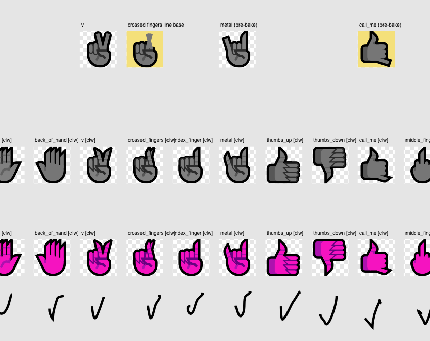
Iterate
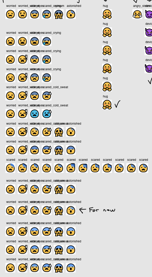
This is taking the symbol (or selection of symbols) I’ve decided to roll with and making them into vector graphics, and seeing how they look in the actual medium and style that Mutant Standard emoji are in.
Sometimes this can be the same as symbolising them because the medium often influences what kinds of symbols will actually work out.
In this process, I won’t just be making one picture of a symbol, I will be putting the symbol I’m thinking about or have a scribble of into vector graphics, and then I will iterate numerous times over until I find something that achieves the best balance of aspects like…
- Readability (at multiple resolutions).
- Aesthetics (at multiple resolutions).
- How effective it feels at communicating what I want it to communicate.
- Stylistic conformity with the rest of the set.
In the process images that I will show, you will notice that most of the effort (and most of the image output) that goes into emoji making goes into this step. Creating something that has the right balance of all of these can be really really challenging, and it leads me to do things like constantly move lines one pixel at a time to make it look just right in multiple resolutions.
Readability and aesthetics tests are done at really wide resolution differences – from 16px, all the way up to the hundreds. I want them to be workable icons, but with details you can appreciate at really high resolutions and sizes.
Unfortunately, not all emoji will work in 16px (or even below 32px – my construction baseline), and I will have to accept that. Emoji were made and designed really for mobile phones, so they tend to follow mobile technology rather than desktop. If a design at it’s core (like a symbol emoji with 4 characters of text) can’t work on standard desktop displays, there’s not much I can do.
Sometimes I’ve iterated a design so many times and I can’t find something that works enough and I’m at a stalemate. When this happens, sometimes I might keep it back and work on it more later with a fresh mind, or if I feel it’s good enough for now, I’ll take it onto the next step.
I can always improve on them later, especially given that this emoji set is in the early stages and the whole shape of the project is only just starting to develop. Sometimes, it just takes looking at something enough to really figure out what could be done better. I keep track of emoji I think need improving in my notes and I periodically improve them as I make new emoji with each new release.
Create Master File
Every finished emoji in Mutant Standard has a ‘master file’. It’s kind of like the gold disc of video games – any published releases or merch originate from this file.
Iterations, sketches, etc. are placed somewhere else for historical record in case I think that an earlier iteration or version I did was better than the one I actually put to master.
There are master files for each emoji for each released version of Mutant Standard, so I can revert changes if i feel like it.
Instead of having literally one Affinity Designer file for each emoji, I have one file covering a group of emoji, like I have one for human hands, occult objects, symbols with Japanese characters with them, and so on.
Within the master file, there are two of each emoji, sometimes three and here’s what I call them and what function they serve:
The Actual Master
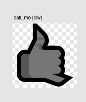
Normally the complete, uncompressed geometry of the emoji. This exists so I can play with or iterate on in the future. This may not always be the case, and that’s where a ‘pre-bake’ version comes in that I will mention next…
Pre-Bake
Not all emoji designs need this. This is for when an emoji’s core design relies on me converting something a stroke to curves (or ‘baking’ it, a term I borrowed from a particular process in CGI where you sacrifice editability for production-ready assets), which means losing some of the editable geometry that went into that design. The pre-bake exists as an uglier counterpart that contains all of the geometry ingredients that went into the actual master.
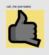
The Compressed Master
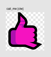
What goes to export. Uncessary layers are flattened and complex geometry gets simplified to reduce SVG size. If it’s an emoji that gets recoloured (like hands), then this is where I recolour the emoji into special export tones that the exporter script recognises and will replace with the actual colours that you see in the published versions.
I also do particular layering and geometric shifting to remove visual artifacts that are natural quirks of how vector programs render stuff.
Export
This process is different depending on where it’s going. There’s not much thinking here since it’s all just technical details. ✨
Web (the normal export for you all to use 💚)
The compressed master is exported to SVG files in Affinity Designer and from there, I use the export script and that does it’s magic in batch recolouring, exporting to PNG at various resolutions and embedding metadata. I just double click a script and let it do it’s thing for about an hour and a half.
I then lovingly bundle each export type (PNG 64, 128, 512, SVG, etc.) up by hand into a ZIP and upload it onto the site.
Print (for merch)
I duplicate the original master file and make a print version of it. I do this because the amount of colours available to your computer screens is higher than what a printer can print, so I have to manually recolour the emoji to make them look good from a printer.
Stickers are exported into a standard high resolution file the merch store expects. For certain emoji that can be put into other types of merch (like pillows and bags), I use custom templates I made in Affinity Designer to make sure everything fits correctly and then I export the templates.
And sometimes, I’ll make custom designs or patterns featuring the print masters and then export those.
…and that’s basically it! It’s a unique little discipline in certain ways and I hope this begins to pull back the curtain on what I do :).