Quick guide!
- Every picture of each file is a snapshot of that file of how it is viewed in Affinity Designer (so you can see each emoji artboard and it’s title).
- You can click on each picture to get a bigger version.
- The captions underneath each picture are the filenames of that sketch file. They’re not always the most descriptive (lol).
- Dates of sketches are the date they started, not the date they finished.
- Progressions go from top -> bottom, left -> right. I often use arrows to show progression when it’s not that obvious.
- [M] means that that particular emoji design is going to the Master File (or at least that’s what I think at that moment in time).
- I do a lot of freehand notes around the emoji iterations to give me an idea of how I’m feeling about them.
- Some of the pictures might be a bit misleading because for some things (like some colour choices and CMs), I don’t actually make little iterations to demonstrate where I started and where I finished because it would take too long to copy, paste, edit, repeat, etc.. So i just iterate over the same images.
Okay, read below the cut to see all the sketches!
Here’s where you will start to notice that the time I start a sketch (which is just what I call any WIP thing that isn’t a master in filenames) can be quite distant from when I finish it. The filenames just indicate the moment I started working on an idea, and I may work on something on and off until it’s finished, and it can take months between those two points.

This is me extending the paw hand colours into the shared CMs. I used two different hands for the test because they represented two distinctive contexts.
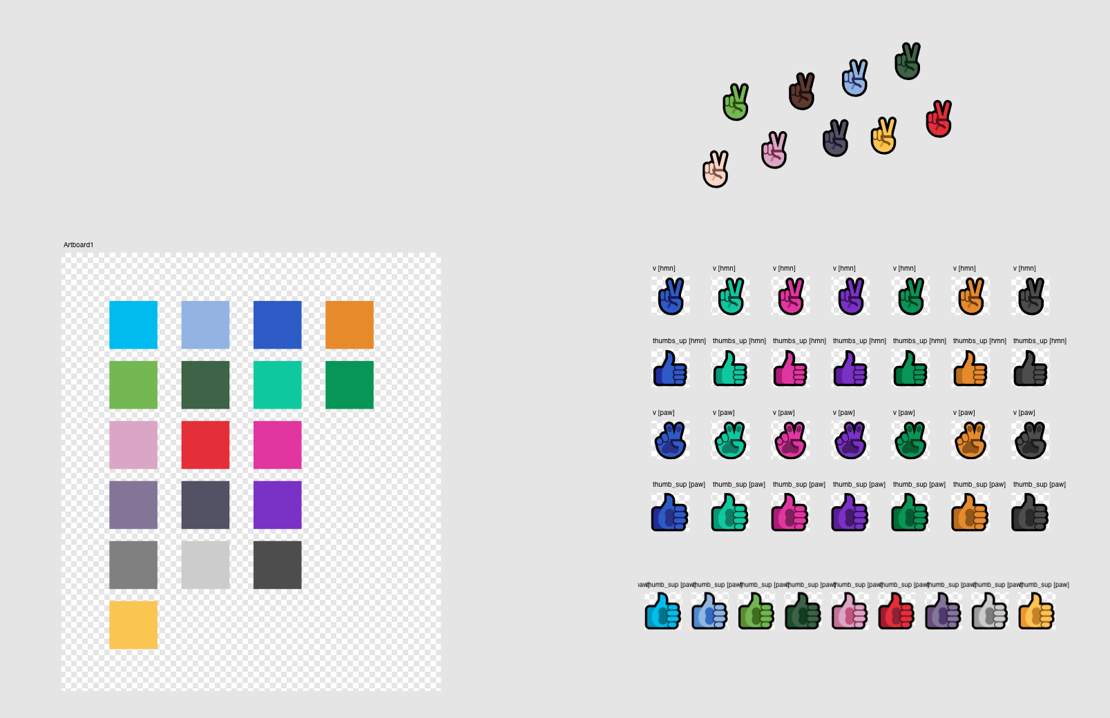
Here’s the first of a few sketches where I start developing the new CMs. I’ve surrounded them in the existing CMs to see how they fit in with existing colours and how they compliment them. Examples of existing CMs on existing emoji have been added to this file as reference so I have a sense of the kinds of lighting and colours I need to create.

Where I test the first pass of the new CMs. I created extra JSON files with the new CMs colours for the exporter and then exported all the hands and splayed them out over different artboards.
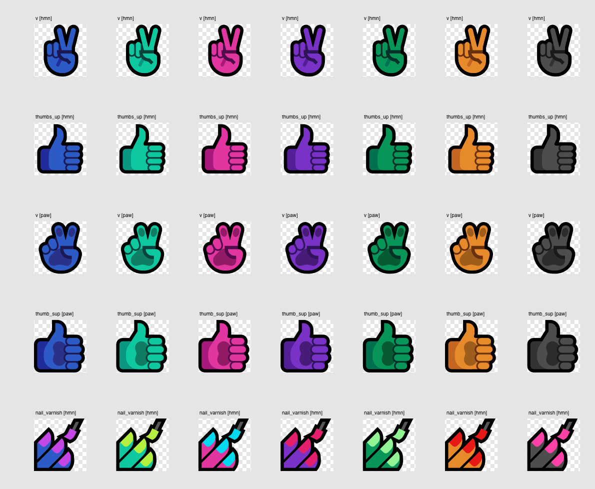
This is the second and final pass for the new CMs. I tweaked a lot of the hues and saturations of the shades, plus added nail varnish colours.
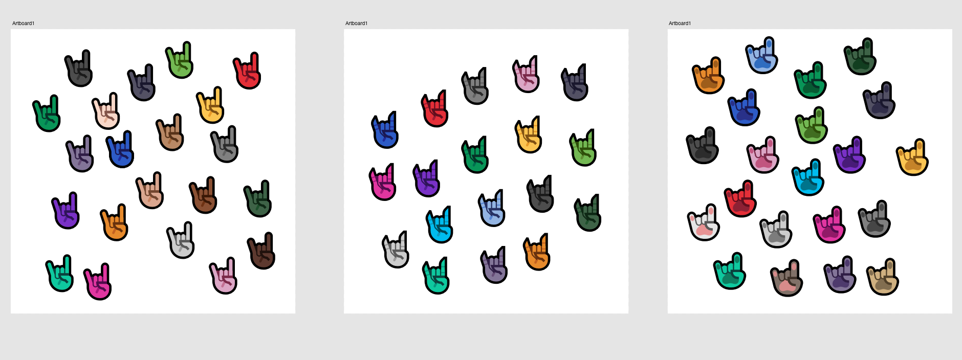
And here’s where I test the final CMs by putting the new CM colours into the exporter, and splaying various results onto artboards once again.
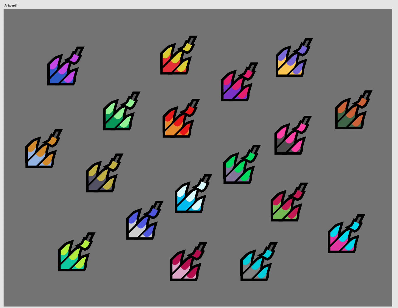
Where I briefly test the new CMs on the new nail_varnish claw hands. Hitting two birds with one stone.
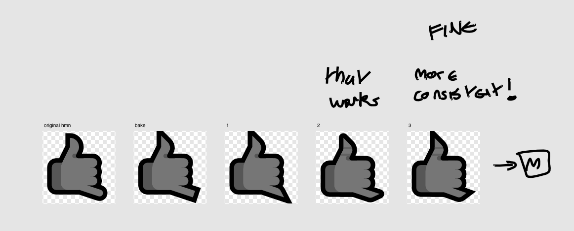
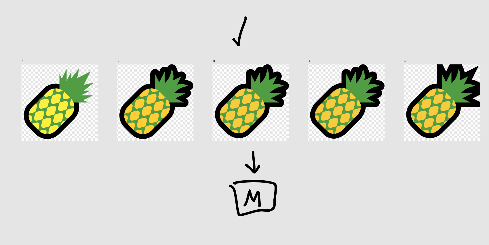
While the line art made it to master file, I actually tweaked the colours to make them more subtle. I didn’t like the sharp contrast between the yellow and the green. I did that in the master file though because I was lazy :D.

A few emoji here are emoji that I’ve finished in previous versions. They are here as reference material for the new emoji.

Because of the size at which I’m working, neither option was great, it’s just the top one was better than the bottom and I didn’t have any better ideas at the time so for now, those are what I went with.
Sometimes my emoji process just works out like that *shrug*.
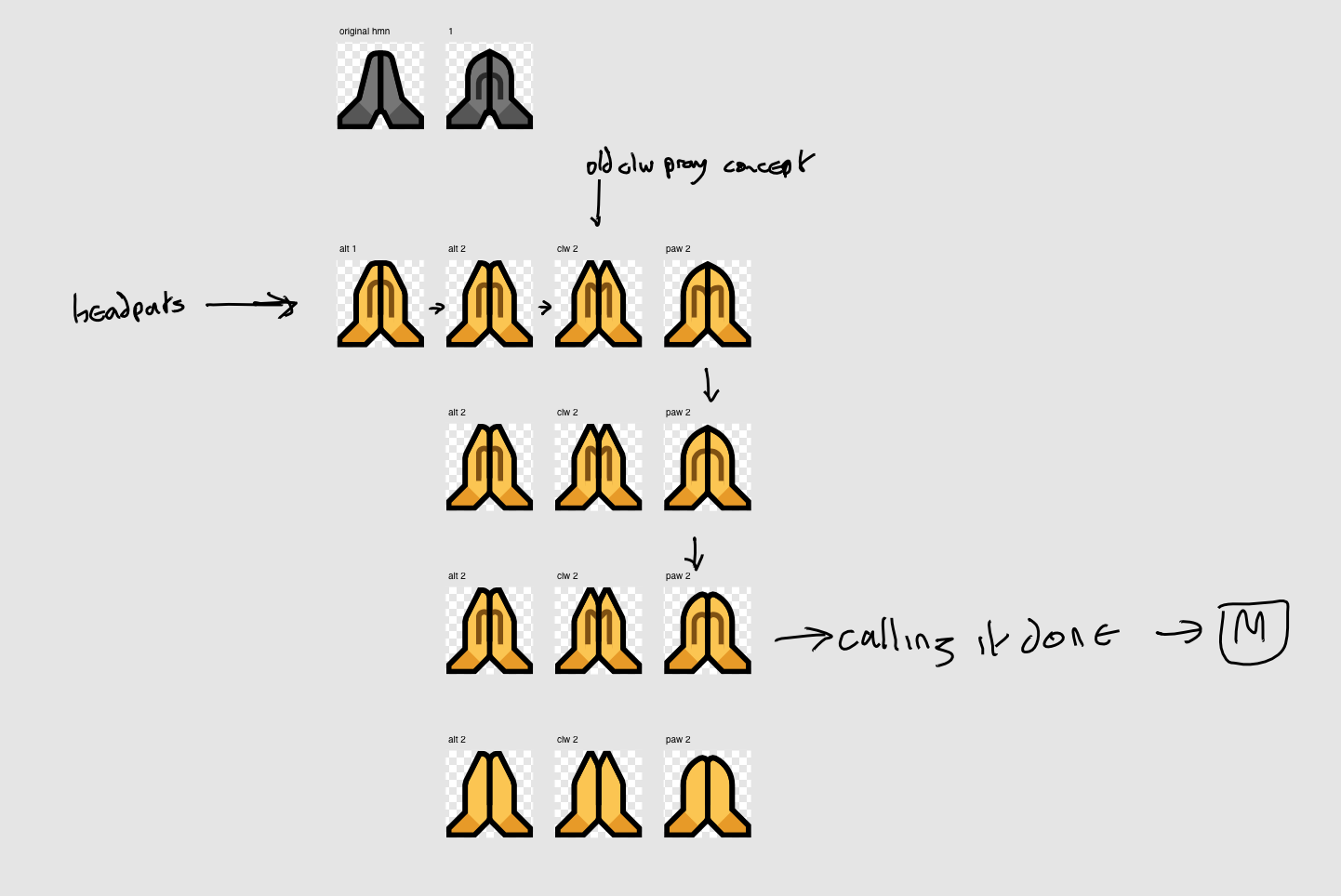
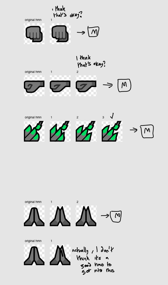
So in an earlier file in this post (MutStd sketch 2017.12.07 – claw hands), I made what I thought would be the praying hand emoji for claws, and I marked it as ready to go in the master file, but when I tried doing a paw hand version for it, I realised that I needed to add an additional finger to make the emoji much more understandable. This decision then filtered back to both the claw hand and the human hand because it was more readable for them too as well as being more consistent.
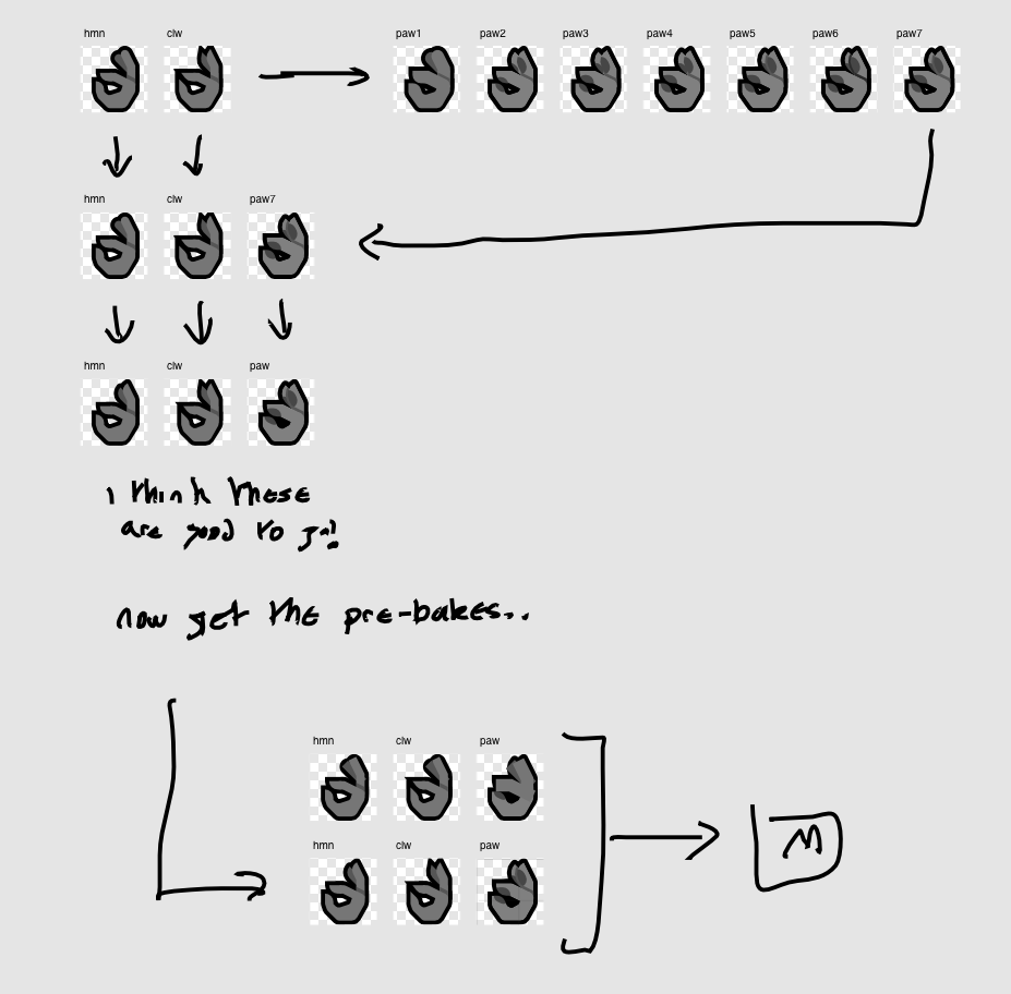
This is another example of an improvement to one morphology of a hand emoji filtering back to the other morphology versions. This was me originally just making the claw and paw versions of ok_hand, but I realised that the human version had issues (the rounded ends to the fingers when viewed from the side – that’s not how fingers look from the side) so I fixed those as I was doing the other hands.
This is also an example of just how much longer paw hands take compared to their counterparts. Sooo many iterations compared to the claw version, which was done in almost one go.
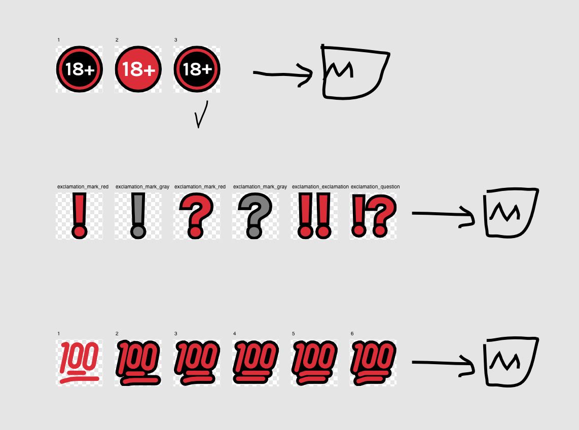
‘Negative symbols’ is a bit of a misnomer. I was originally going to just do negative symbols (ie. 🚫📛🛑❌🚷) because I actually have some in the works, and I grouped up these other symbols with the negative symbols because just they were red too. You might see the *real* negative symbols in 0.1.1.
Anyway, these are just some red symbols. This is where I made my very own 💯 just in time for the next one (which was an idea that really came on a whim to me).
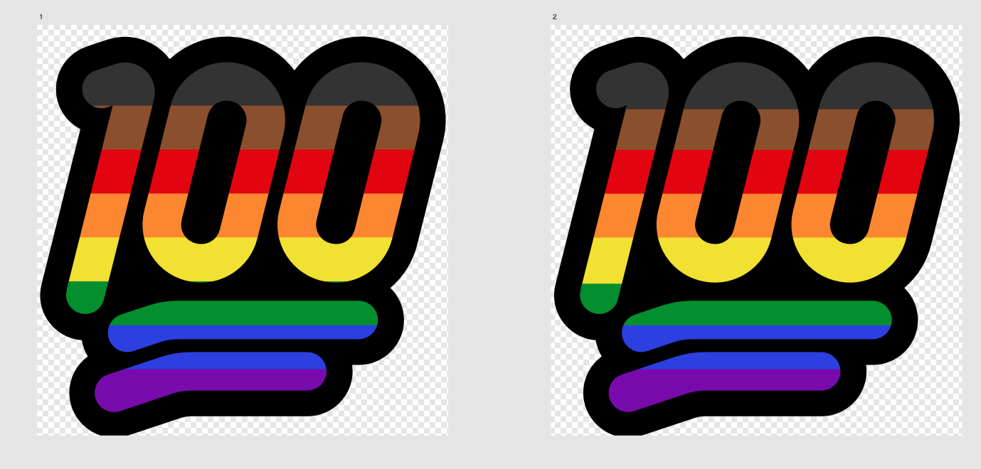
I just copied and pasted the stripes for the new rainbow flag (which doesn’t have a sketch here because it wasn’t really any effort) into the 💯 symbol. The first one is a direct copy, the second one has slightly shifted stripes to make the clipping cleaner (the brown stripe is shorter so you don’t see it at the tip of the 1 and the green is shorter so you don’t see little tips at the 00s).
This is quite a nice example of how accurate (as in having stripes that are exactly the same height as each other) isn’t always the same as aesthetic.
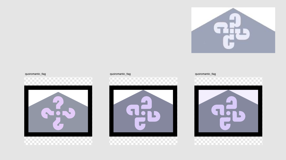
I added the original Quoiromantic flag (top picture) as reference and then tried to adapt it into emoji and into Mutant Standard’s style.
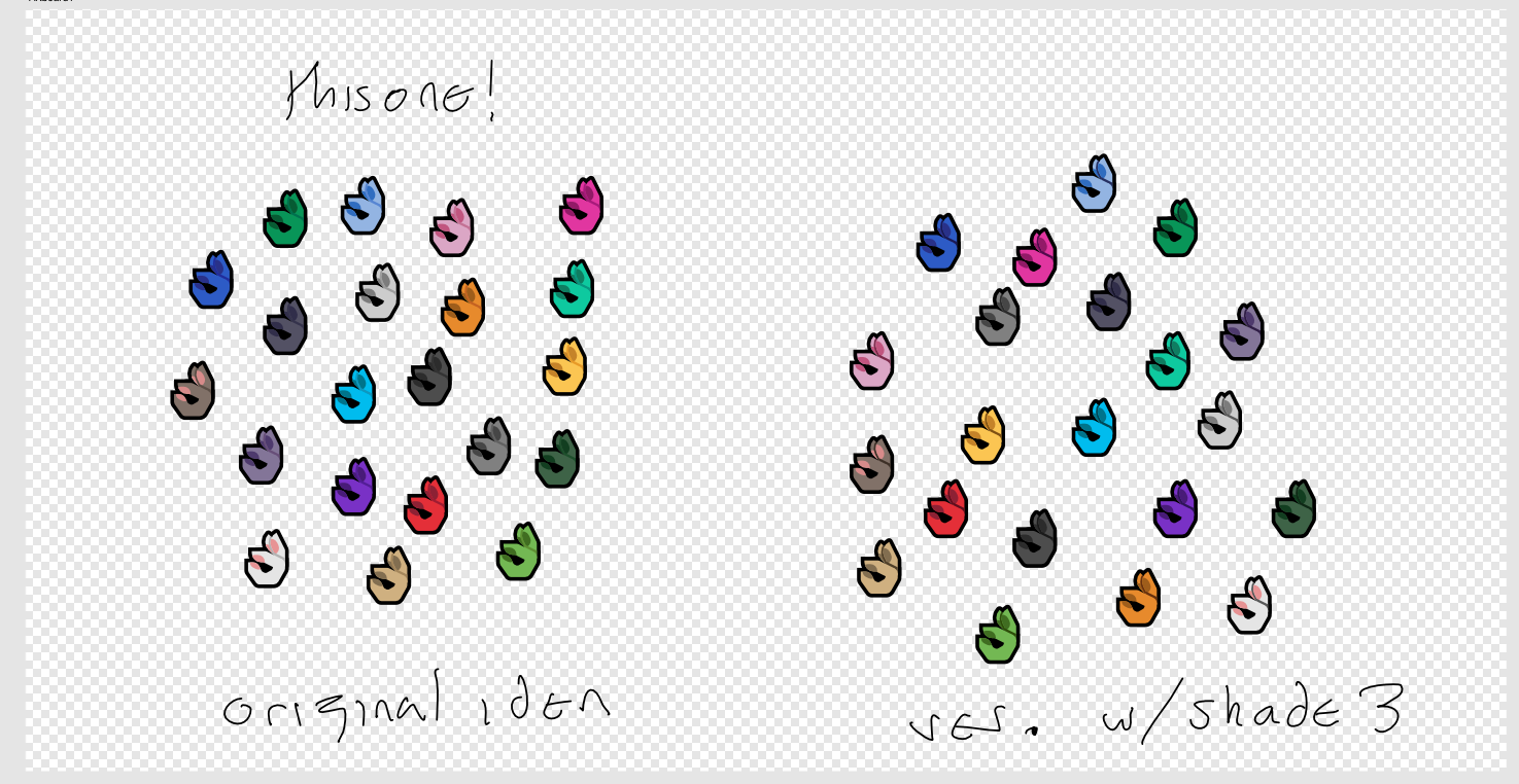
This was a list minute test as I was getting 0.1.0 packaged and out the door. I wasn’t sure if a particular part of the hand was shaded too lightly. It was using ‘Shade 2’ (left emoji pile) and so I tried ‘Shade 3’ in that area instead (right emoji pile). I didn’t like it and so I kept the original.