Here’s my sketches for 0.3.1!
In general, looking back, I feel like a lot of what I did here was continue the new thinking that was started in 0.3.0, but was constrained with the design system baggage of earlier versions, and I feel that a good few of these just don’t reach their potential as a result. Some of these, I still really like.
MutStd sketch 2018.09.13 gust
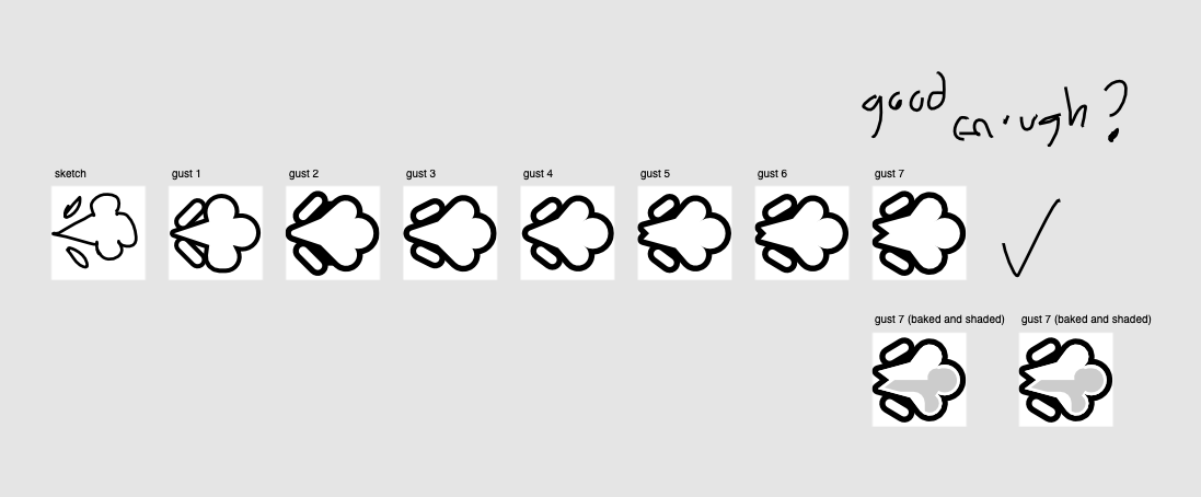
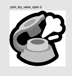
The gust of wind happened in this release because I was directly inspired by a commission I did during this version’s production cycle of an inflatable nozzle being opened with air escaping.
I liked the way the gust of wind looked like coming out of the inflatable nozzle so I imitated that aesthetic approach for the gust.
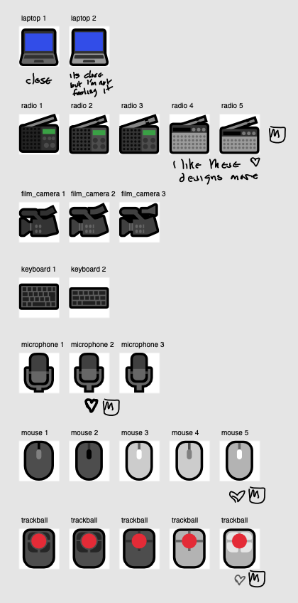
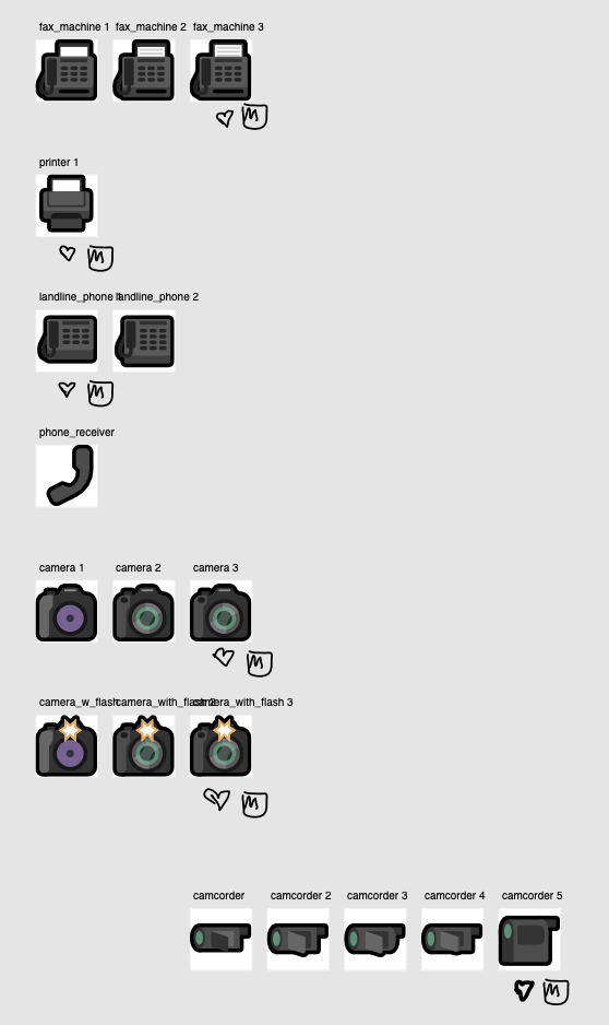
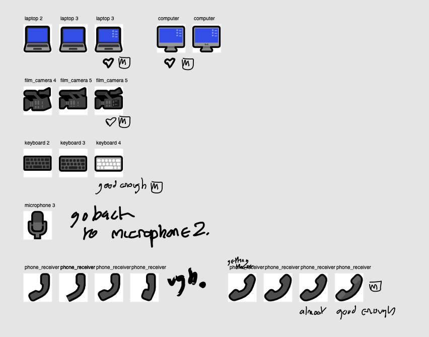
MutStd sketch 2018.09.13 tech
I had a very particular angle within this subset of emoji based on my feelings about existing emoji designs for this area:
- I don’t appreciate or enjoy the Americana-style nostalgic design of many objects that can be seen in Apple’s emoji designs as well as other vendors. Many of these objects do have modern interpretations, why not take them into the 21st century?
- Dated or unappealing designs for various tech objects could be interpreted as an attempt by Silicon Valley to make legacy technologies – that are valid, working and people still use on a daily basis (like pagers, radio and fax machines) – to look dated and crappy, compared to their oh-so-wonderful computer and internet-based products. They deserve to be treated with dignity and respect.
MutStd sketch 2018.09.15 paws
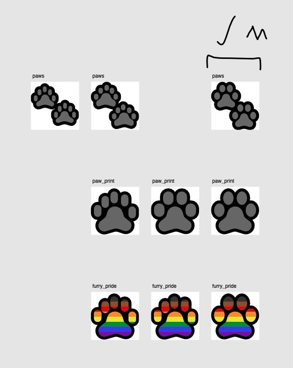
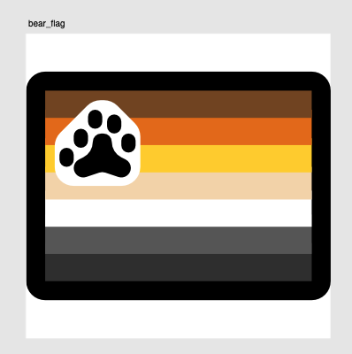
These emoji both covered the Unicode paw prints emoji, but also what I thought would be a good idea – singular paw print and furry pride emoji (which encoding-wise is formed from a ZWJ of rainbow and this singular paw print). The design lineage for these can be traced back to the bear flag emoji:
MutStd sketch 2018.09.18 – office stuff
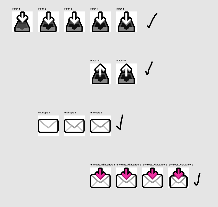
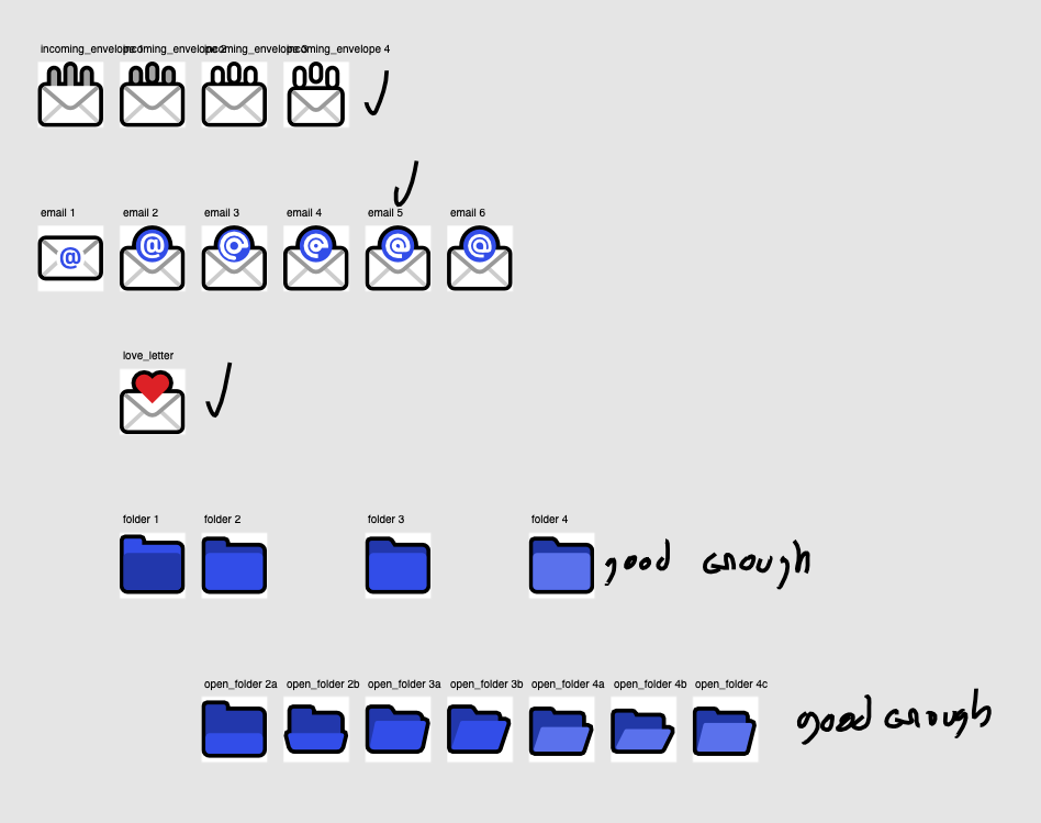
For me, this really became the start of using 3D arrows in other emoji, as well as creating a softer aesthetic for Mutant Standard – which would be continued into 0.4.0 on a wider scale.
I’m not that happy with how the closed and open folder look – the open folder kinda looks like just a rotated version of the closed folder. Something to be improved on in a future release!
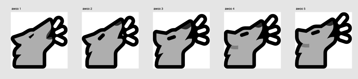
MutStd sketch 2018.09.18 new awoo
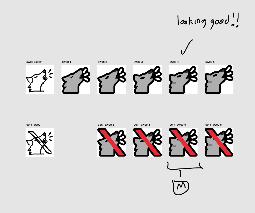
Signs like ‘GAY’ and ‘SO GAY’ are really popular and I wouldn’t want to take them away, but I also wouldn’t ever encode them because of their dependence on the English language.
While the text signs ‘AWOO’ and ‘DONT AWOO’ are more memeable (and still are often in use in various places on Mastodon), I figured it would be nice if they could be turned into something that doesn’t rely on English, and in doing so, I could encode them (which I did in this version).
MutStd sketch 2018.09.19 mailboxes
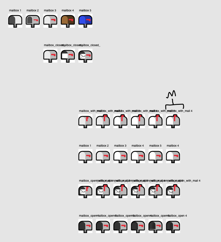
The roundness, shading and depth in the office objects continues here. This is the first time if I recall correctly where I have shadows as detailed as in the ‘mailbox open with mail’ emoji.
MutStd sketch 2018.09.28 leftover expressions
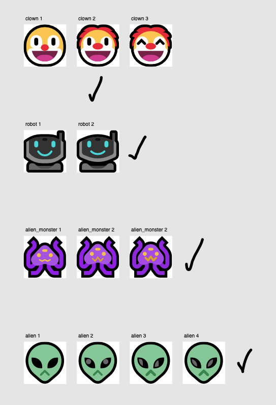
The design of the robot partly came from a desire to represent more modernised interpretations like tech emoji, and also a love letter to various Japanese prototype robots of the 90’s and 00’s, especially QRIO. It was also inspired by robot mechanics of that time and presently – it presents a human-like face as if it’s looking at you, but it’s visual sensors are actually located in a hidden hole on it’s forehead.
Even though the sketches of the alien monster are in purple here, I quickly changed it to blue in the master files at the last minute to differentiate it from the demon smileys.
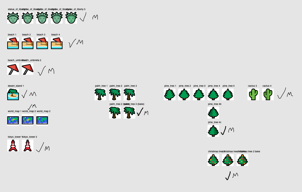
MutStd sketch 2018.09.28 monuments and plants
MutStd sketch 2018.10.11 last tech
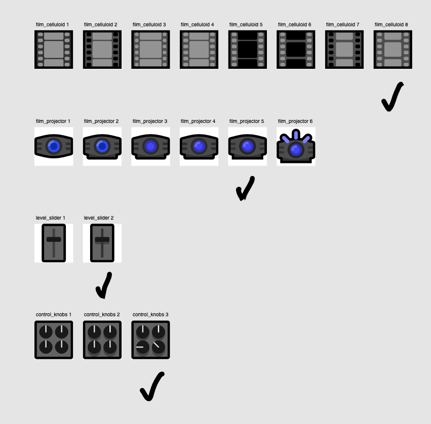
The decision to use a domestic home projector over traditional projector emoji (despite how much of a deviation it would be from the norm) was twofold:
- Like all the other tech, I didn’t want to use dated appearances for something that isn’t actually dated.
- Modern cinema projectors are technically impressive, but are deeply ingrained with really oppressive DRM practices that favour copyright holders, which is bad in itself but also has parallels with the way big media companies repetitively try to strangle expression and sharing on the internet.
A home projector – HDMI encryption and that lot aside – in practice basically lets you play whatever you want, so that’s the form I went for.
Looking back on this, I actually prefer the last projector emoji than the first. I’ll change it sometime…..
MutStd sketch 2018.10.11 tengu
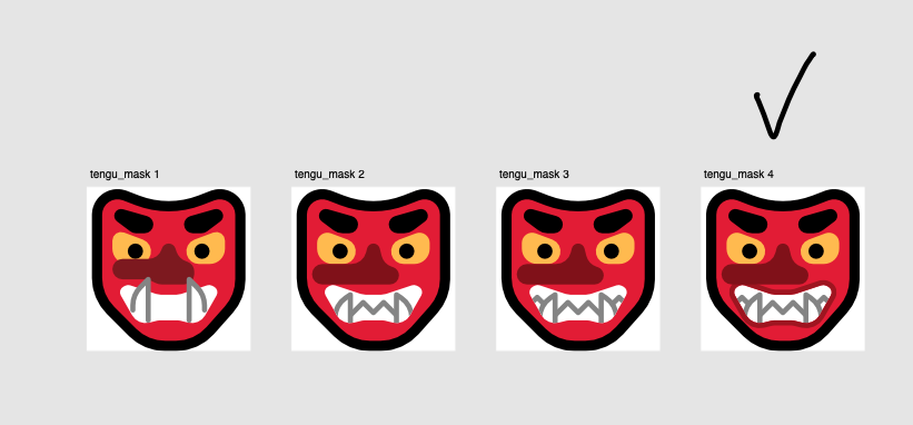
I’m not that keen on this, will probably change it sometime.
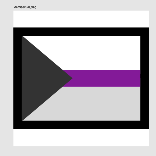
MutStd sketch 2018.10.12 demisexual flag
MutStd sketch 2018.10.14 Lynx
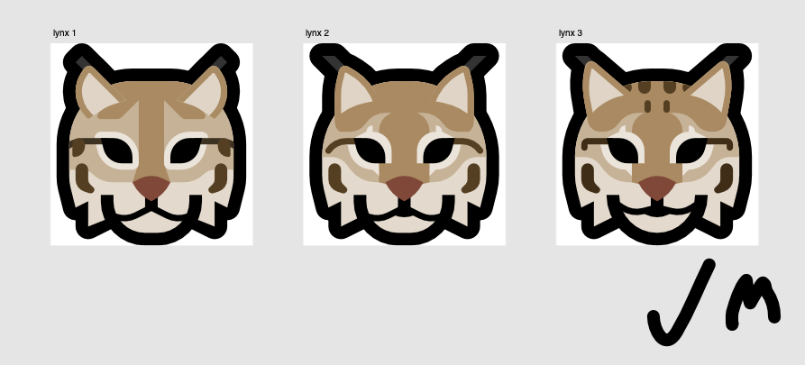
It’s the shoutymeow Lynx! This design came from the Eurasian Lynx, more specifically.
MutStd sketch 2018.10.14 silhouettes
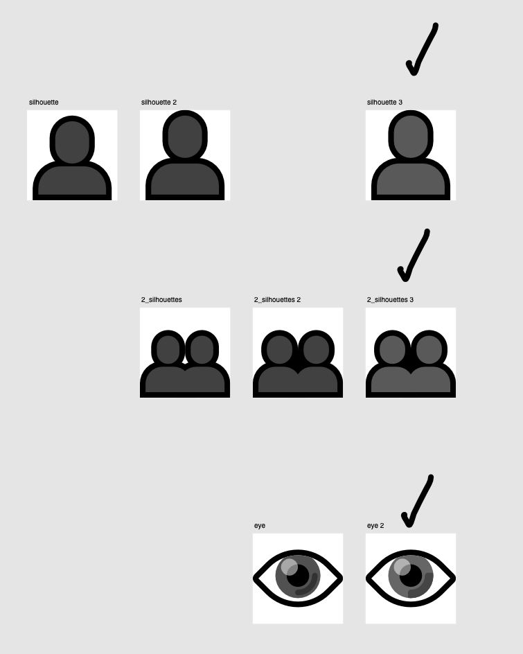
I’m not that keen on the way the silhouettes look. I know they’re supposed to be silhouettes, but IDK, I feel I could do a lot better.
MutStd sketch 2018.10.24 household objects
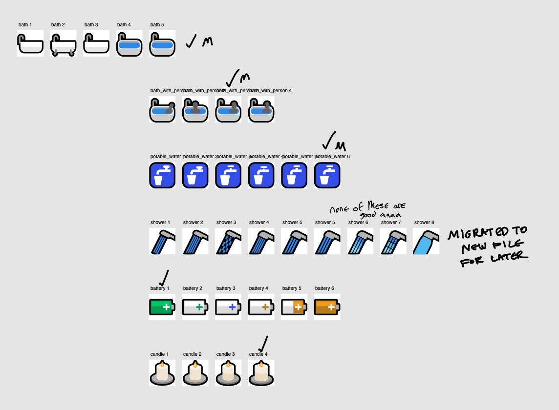
The bath and battery emoji really continue this feeling of having an idea of how to improve my technique and aesthetic approaches, but not being particularly sure how and falling short of my own expectations
The candle emoji design was a descendant of a memoral emoji I made for Natalie Nguyen.
MutStd sketch 2018.10.24 symbols n shit
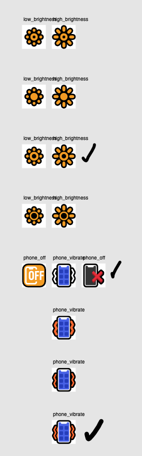
The phone vibration lines were inspired by the Windows Phone 8/8.1 vibrate icon (which I like a lot, and you can see remnants of it in Microsoft’s current phone vibrate emoji) and Google’s own interpretation of this emoji.