Here are all the sketches from 0.2.4, and a very long commentary. I am now making notes as I’m making the emoji, so giving you commentary is more efficient more detailed, and less scary to post at the end of a version because I have all the content already available.
Remember, sketch file names are just the date they were begun, so there will be disjointedness from file to file. Enjoy!
Intro
This update was a response to a variety of things that I had a problem with and I felt like I finally had developed a variety of design solutions and methods to tackle them.
There were a bunch of emoji designs which I didn’t like the implementation or the core idea for. There were also a lot of geometry fixes that were necessary to improve the rendering I couldn’t get round to while I was making them because Affinity Designer can be rather temperamental from version to version.
While I love most of the core ideas, the smileys were smaller than they needed to be within the canvas area and the aesthetics and implementations weren’t as good as they could have been. So alongside brushing up a lot of rendering and design bugs, I decided to take on all the smilies and revise their designs.
During 0.2.4, I was feeling more invigorated and less in a rut since opening myself to emoji commissions, because I’ve had to take on new design challenges, and I can bring back new-found expertise into Mutant Standard emoji (also my mental health was substantially better during the making of these emoji).
I was more confident and was more comfortable in taking a more rapid approach to making emoji, where I’d jump between designs, instead of grinding on the same design quite intensely for a while (which also came from my commission work practice).
I’m super-happy with how things have turned out and the improved style of the emoji in this release is going to be a blueprint for future improvements and emoji. E:
Sketches
My main goal with the smilies was to be super-duper efficient because I may notice mistakes and change things later (it seems that time plays a big role in how and if emoji designs get changed). Quickly brush up the existing emoji to the new format, don’t spend too long on implementation details unless it’s a design I really want to redo. (I have been pretty happy with the fundamental idea behind each smiley, apart from a few.)
Mistakes and accidents played a big role in many of the design changes in this version.
Some things changed between sketches and masters that you couldn’t see:
- I experimented with rounded exclamation marks in shock-fear-exhaustion emojis and I liked them so I brought them back to
very_big_smile, which I put down as being completed earlier. - Various small things were fixed after sketches because it was a lot quicker to do than making their own file just for making a quick fix, so you’ll see some variability between what was considered ‘finished’ in the sketch and the actual final result.
MutStd sketches 2018.06.20 emoji improvements
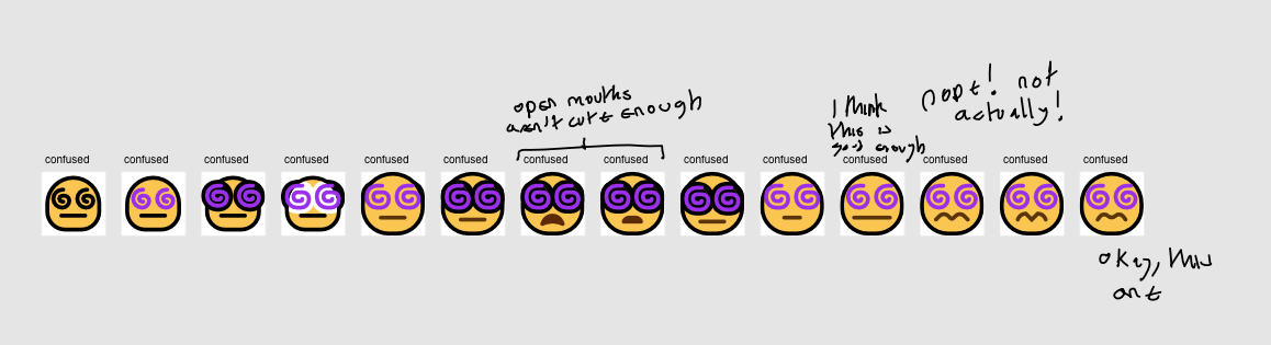
I wanted to make the confused swirls more prominent and feel less like a part of the face so to speak (making the lines black makes them feel more grounded and set in the face, instead of an extension of that smiley’s expressions).
You’ll also see a similar philosophy with how the smiley mouths have changed from being black to a dark shade of yellow (to distance themselves visually from the eyes and make the smilies look less flat).
MutStd sketches 2018.06.23 open smileys revised
The starting point for where I decided to redo all of the smilies. As you can see on the top left, I experimented with a variety of methods of drawing the corner-pieces to an expression (the exclamation mark and forehead sweat drop). I settled on a new rendering technique, which used subtle darker outline to differentiate white objects from the smiley yellow colour so they didn’t need a black outline.
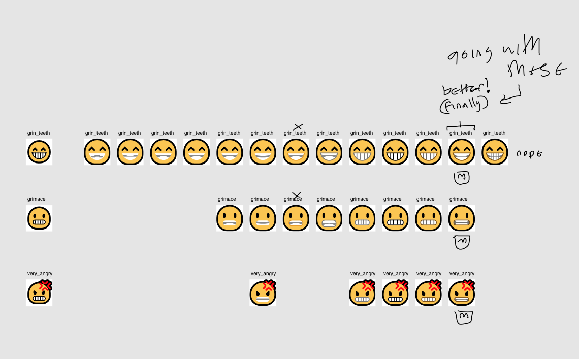
MutStd sketches 2018.06.24 grin teeth revised
The old teeth were not that popular among my friends (and I can kinda understand why), and they didn’t scale well, so I needed another abstraction method to convey teeth.
Drawing good teeth that scaled well to extreme differences in resolution was quite a big challenge, but I’m happy with what I came up with in the end, it does all of the things I wanted it to!
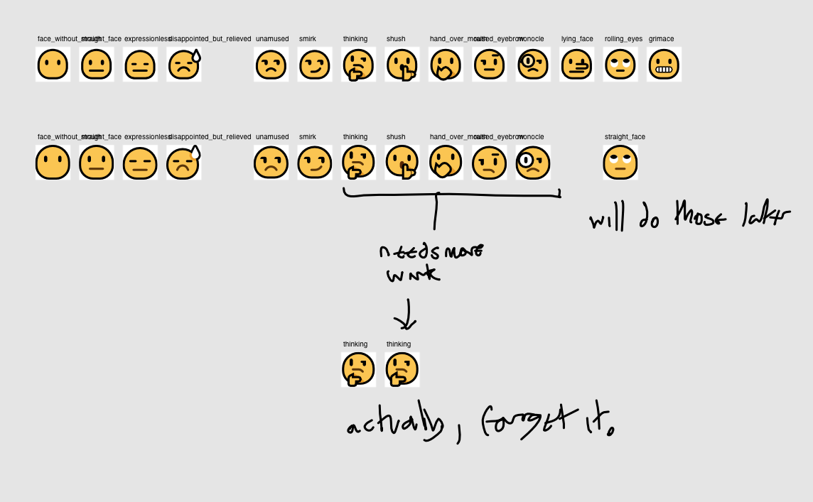
MutStd sketches 2018.06.24 sarcasm-unamused smiley redesigns
These were mostly just expanded versions of the originals. I really liked how I did nearly all of these in the originals and I didn’t want to fundamentally change them.
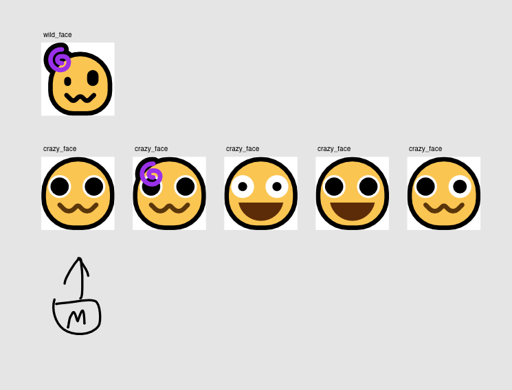
MutStd sketches 2018.06.25 new crazyface
I tried a variety of ideas here, often influenced by what other vendors were doing, but in the end, I opted for something quite divergent. I did this because I felt it communicated the idea in a uniquely appropriate way and one that suited the aesthetic of the project/set very well.
The main inspiration for the final design came from an amusing accident when making an emoji commission for someone. It also fits better into a running theme of Mutant Standard smilies (which is in contrast to other sets I’ve seen) – when a smiley is overwhelmed or confounded, the expression is usually quiet and inward-focused rather than outward.
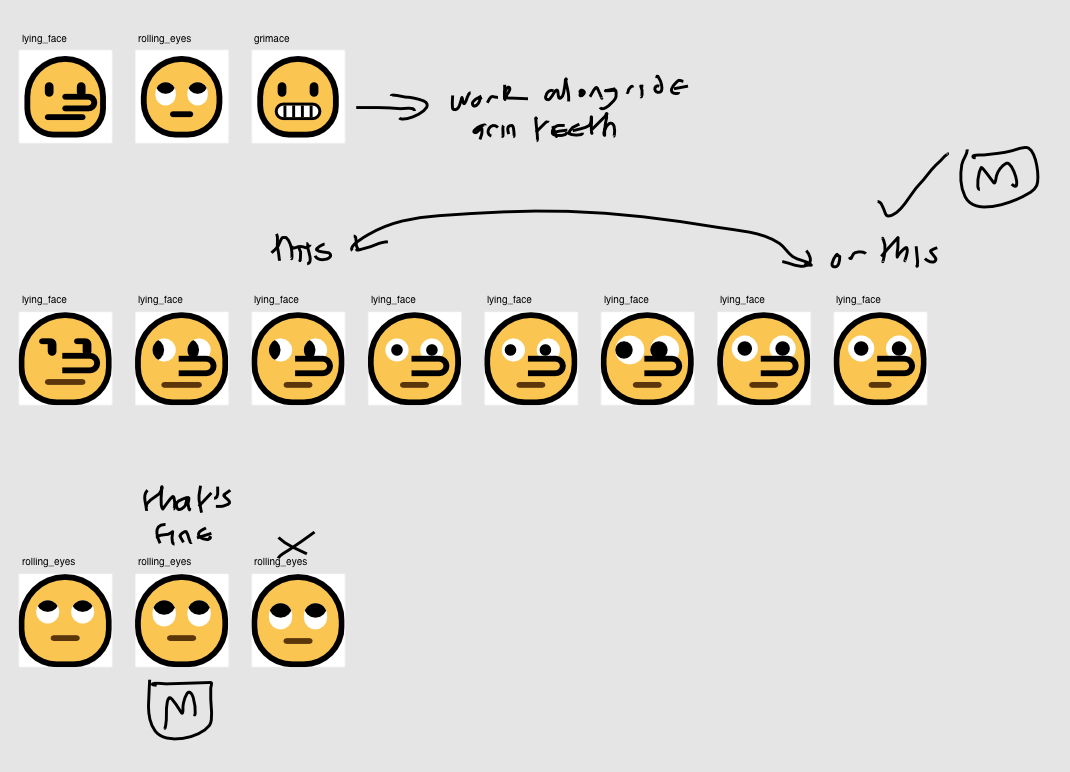
MutStd sketches 2018.06.25 sarcasm-unamused smiley redesigns, remainders
I realised I wanted to make the lying face look like someone who was caught in the act of lying, rather than simply their nose getting bigger and them seeming puzzled or disappointed. So I combined elements of the embarrassed face into this.
I also went over the rolling eyes face in this file.
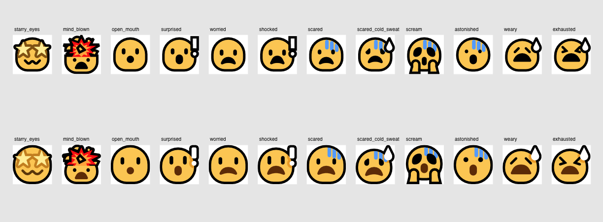
MutStd sketches 2018.06.25 shock-fear-exhaustion redesign
Notice how I try to remove as many unnecessary internal black lines as much as possible, like on the beads of sweat and on exclamation marks (that was developed from an earlier sketch in this blog post).
From personal experience, the old internal black lines often made things feel too dull and dark and made the emoji look aesthetically work at smaller sizes, so it was that sitting around with the designs long enough that enabled me to detect design problems like those.
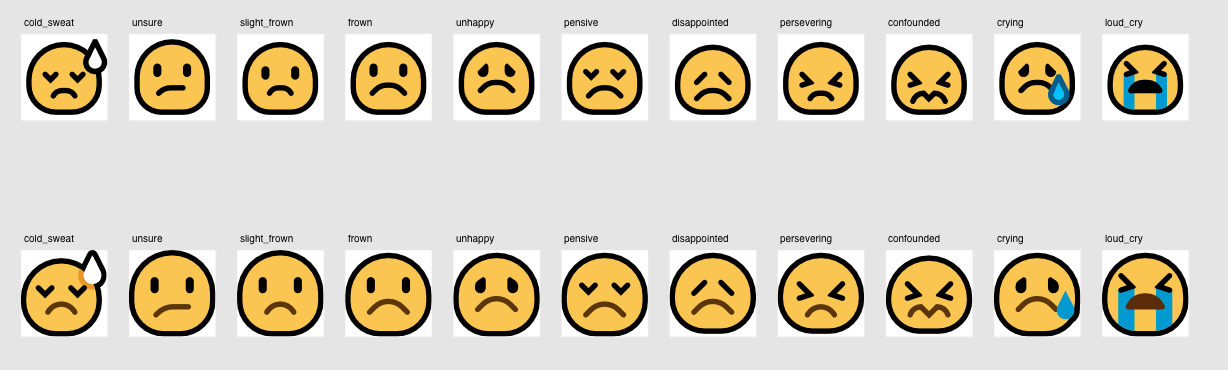
MutStd sketches 2018.06.25 unhappy smilies redesign

MutStd sketches 2018.06.26 custom smiley redesigns
Continuing with the theme of inward-facing expressions if a smiley is overwhelmed, the dead smiley’s mouth has been changed from an open mouth to a Nirvana-esque closed expression.
owo (later renamed to soft ) will be mentioned a bit later in this blog post.

MutStd sketches 2018.06.26 embarrassed-infatuated smilies redesign
I decided to make the smiles bigger on many of these, to convey a bit more outward-facing warmth.

MutStd sketches 2018.06.26 mistake smiley
This custom smiley face (later called soft) resulted from making the kiss face mouth, because I initially constructed the lines at a 90˚ angle from what it normally is before rotating it, resulting in the face you see above, and I realised that I should probably spin that off into it’s own thing because I know a lot of people would appreciate it.
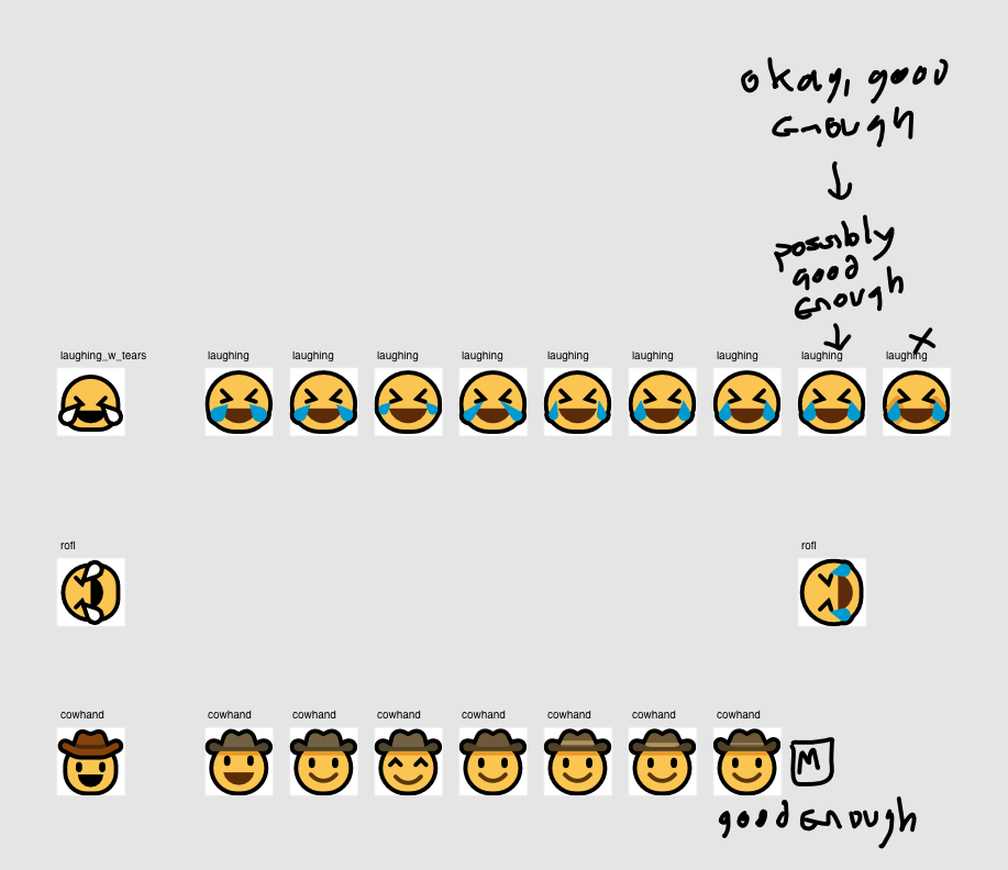
MutStd sketches 2018.06.27 laughing with tears + cowboy redesigns
I’m still not that happy with the laughing smiley, but I ran out of ideas at that point, and this was still an improvement over the original.
The cowboy (which was long an emoji design I took issue with) is nice and I think it’s pretty great now!
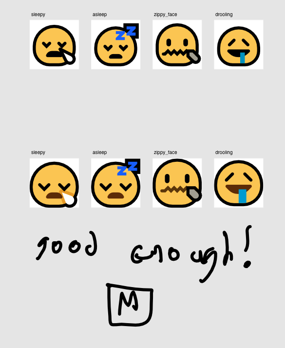
MutStd sketches 2018.06.27 shock-fear-exhaustion smilies remainder
Basically the same, but bigger~

MutStd sketches 2018.06.27 sick and angry smiley redesigns
I am super-happy with how the imp smileys (called devious in these images) evolved, they look both more cute and more devilish, and the aesthetic is more evocative of the kinds of things I want the set to harken to in many ways (Y2K aesthetics, old smilies, the ‘dreamcast’ look, etc.)
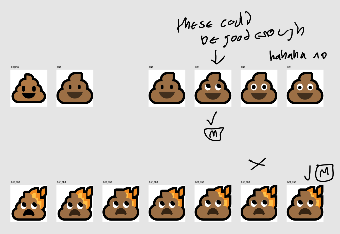
MutStd sketches 2018.06.27 smiley redesigns – shit
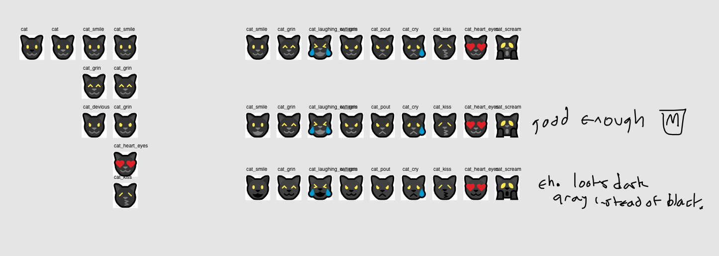
MutStd sketches 2018.06.28 cat smilies
As mentioned in the release notes, I really felt drawn to the idea of using black cats, mostly because of the rich amount of symbolism behind them that could be tapped into in a way that wouldn’t amount to shitty reductivism or appropriation, they can improve the profile of black cats, who are unfortunately less likely to be adopted than other kinds of cats, and they also work as a statement to just buck the trend of literally what every other emoji vendor was doing, just because I can. (And in the context of this project and the issues it’s trying to bring up, I think that can be very important and useful if it’s not getting in the way of other things, which this isn’t.)
Another thing that’s different compared to other vendors is that these emoji look more like cats and have more cat-like mouths in many ways.
I was initially concerned that this idea wasn’t going to work because I’ve never really done light-on-dark designs like this before, but I’m pretty happy with how they turned out, and the response to them has been really great.
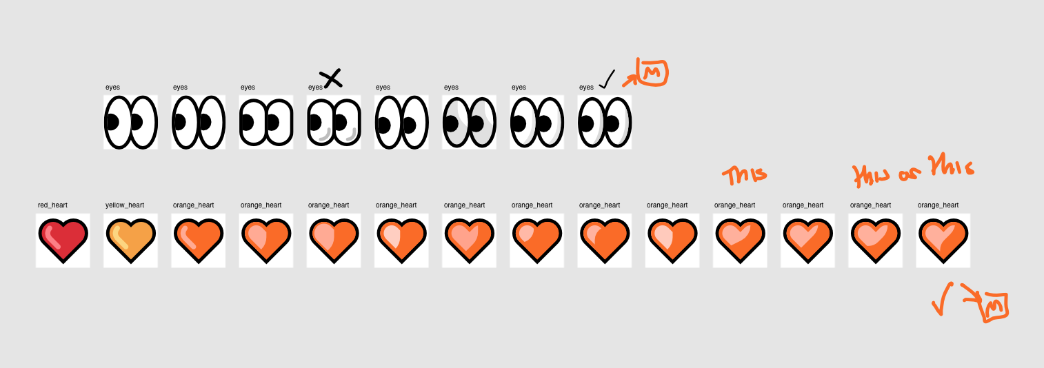
MutStd sketches 2018.06.29 eyes and orange heart


When it came to make the orange heart, I felt that it wasn’t enough to just make the heart and leave it at that. I really wanted to improve the shading.
Inspired by what I thought were very successful shading techniques in various emoji like the cloud and water droplet emoji (pictured above), I wanted to give the hearts the same treatment. It took a bunch of attempts, but I’m really happy with the feeling of depth and the unique aesthetic feel of these.
Based on the continued success of this method, this shading method will eventually extend to most/all emoji like these.
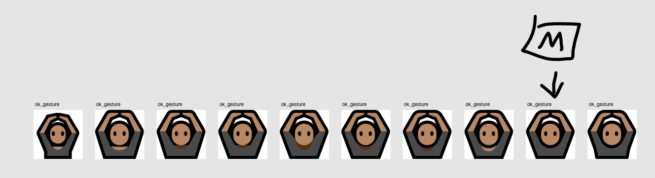
MutStd sketches 2018.06.29 ok_gesture redesign
I realised that the anatomy of this expression was faulty (plus the emoji didn’t take up as much of the canvas as it should), so it was fixed.